Another summer and another edition of the Copa América! Along with the Africa Cup of Nations, Nations League finals, the Women’s World Cup, Under-21 European Championship AND the Gold Cup this is yet another soccer-filled season after last year’s World Cup and the Asian Cup earlier this year (I also did a blog post on these last two tournaments which you can see here (World Cup) and here (Asian Cup)). There is so much football going on at once even I can’t keep up, especially with the time difference! To not redo all the previous visualizations with Copa América data I tried to find new sources of data and other forms of visualizations to give some insight into the players and teams competing to be the champion of South America. You can find all the code I used in this blogpost here and you can also find other soccer related data viz in my soccer_ggplot Github repo.
The sections will go from a very macro-level view of the historical records of the tournament, to the squads competing, the teams’ match record in the Copa América, and finally to a micro-level view of various attacking players using xG statistics.
¡Vámonos!
Packages
library(dplyr)        ## data wrangling
library(tidyr)        ## data wrangling
library(purrr)        ## data wrangling and iteration
library(stringr)      ## data wrangling
library(rvest)        ## webscraping
library(polite)       ## webscraping (Github only pkg)
library(ggplot2)      ## plotting
library(scales)       ## plotting scales
library(ggimage)      ## images for flags
library(ggforce)      ## plotting text labels
library(cowplot)      ## plotting grid
library(glue)         ## text
library(ggrepel)      ## plotting text labels
library(magick)       ## plotting
library(kable)        ## tables
library(ggtextures)   ## soccer ball emoji as geom_col()
library(extrafont)    ## fonts: Roboto Condensed

loadfonts()
theme_copaAmerica
I wanted to have all the plots in this blogpost to have a consistent color theme. As the tournament is going to be held in Brazil, I went with a color theme based on its flag with blue, yellow, and green being the primary colors.
theme_copaAmerica <- function(
  title.size = 24,
  subtitle.size = 14,
  caption.size = 8,
  axis.text.size = 14,
  axis.text.x.size = 12,
  axis.text.y.size = 12,
  axis.title.size = 16,
  strip.text.size = 18,
  panel.grid.major.x = element_line(size = 0.5, color = "white"),
  panel.grid.major.y = element_line(size = 0.5, color = "white"),
  panel.grid.minor.x = element_blank(),
  panel.grid.minor.y = element_blank(),
  axis.ticks = element_line(color = "white")) {
  ## Theme:
  theme(text = element_text(family = "Roboto Condensed", color = "white"),
        plot.title = element_text(family = "Roboto Condensed", face = "bold",
                                  size = title.size, color = "yellow"),
        plot.subtitle = element_text(size = subtitle.size),
        plot.caption = element_text(size = caption.size),
        panel.background = element_rect(fill = "#009b3a"),
        plot.background = element_rect(fill = "#002776"),
        axis.text = element_text(size = axis.text.size, color = "white"),
        axis.text.x = element_text(size = axis.text.x.size, color = "white"),
        axis.text.y = element_text(size = axis.text.y.size, color = "white"),
        axis.title = element_text(size = axis.title.size),
        axis.line.x = element_blank(),
        axis.line.y = element_blank(),
        panel.grid.major.x = panel.grid.major.x,
        panel.grid.major.y = panel.grid.major.y,
        panel.grid.minor.x = panel.grid.minor.x,
        panel.grid.minor.y = panel.grid.minor.y,
        strip.text = element_text(color = "yellow", face = "bold",
                                  size = strip.text.size,
                                  margin = margin(4.4, 4.4, 4.4, 4.4)),
        strip.background = element_blank(),
        axis.ticks = axis.ticks
        )
}
Top Goal Scorers // Goleadores
For this plot I took the stats from the Spanish version of the Wikipedia
page as it had more content. I used purrr::flatten_df() to squish the
list output into a dataframe then set the names of each column using
purrr::set_names().
url <- "https://es.wikipedia.org/wiki/Anexo:Estad%C3%ADsticas_de_la_Copa_Am%C3%A9rica"

session <- bow(url)

copa_top_scorers <- scrape(session) %>%
  html_nodes(".mw-parser-output > table:nth-child(95)") %>%
  html_table() %>%
  flatten_df() %>%
  set_names(c("player", "country", "goals")) %>%
  mutate(image = "https://www.emoji.co.uk/files/microsoft-emojis/activity-windows10/8356-soccer-ball.png")
glimpse(copa_top_scorers)
## Observations: 22
## Variables: 4
## $ player  <chr> "Norberto Méndez", "Zizinho", "Lolo Fernández", "Sever...
## $ country <chr> "ARG Argentina", "BRA Brasil", "PER Perú", "URU Urugua...
## $ goals   <int> 17, 17, 15, 15, 13, 13, 13, 13, 13, 12, 12, 11, 11, 11...
## $ image   <chr> "https://www.emoji.co.uk/files/microsoft-emojis/activi...
Like in the Asian Cup blogpost I use Claus Wilke’s ggtextures package to use soccer ball emoji as the column image in the plot.
copa_goleadores_raw_plot <- copa_top_scorers %>%
  head(5) %>%
  ggplot(aes(x = reorder(player, goals), y = goals,
             image = image)) +
  geom_isotype_col(img_width = grid::unit(1, "native"), img_height = NULL,
    ncol = NA, nrow = 1, hjust = 0, vjust = 0.5) +
  geom_text(aes(label = goals, family = "Roboto Condensed", fontface = "bold"),
            size = 7.5, color = "yellow",
            nudge_y = 0.5) +
  coord_flip() +
  scale_y_continuous(breaks = c(0, 2, 4, 6, 8, 10, 12, 14, 16, 18),
                     expand = c(0, 0),
                     limits = c(0, 19)) +
  labs(title = "Top Scorers of the Copa América",
       subtitle = glue("
                       Most goals in a single tournament: 9
                       Humberto Maschio (Argentina), Javier Ambrois (Uruguay), Jair (Brazil)"),
       y = "Number of Goals", x = NULL,
       caption = glue("
                      Source: Wikipedia
                      By @R_by_Ryo")) +
  theme_copaAmerica(title.size = 26,
                    subtitle.size = 16,
                    caption.size = 12,
                    axis.text.size = 18,
                    axis.title.size = 18,
                    panel.grid.major.y = element_blank(),
                    axis.ticks = element_blank())

## Add flags to y-axis:
axis_image <- axis_canvas(copa_goleadores_raw_plot, axis = 'y') +
  draw_image("https://upload.wikimedia.org/wikipedia/en/0/05/Flag_of_Brazil.svg",
             y = 16.5, scale = 1.8) +
  draw_image("https://upload.wikimedia.org/wikipedia/commons/1/1a/Flag_of_Argentina.svg",
             y = 12.5, scale = 1.8) +
  draw_image("https://upload.wikimedia.org/wikipedia/commons/f/fe/Flag_of_Uruguay.svg",
             y = 9, scale = 1.8) +
  draw_image("https://upload.wikimedia.org/wikipedia/commons/d/df/Flag_of_Peru_%28state%29.svg",
             y = 5.25, scale = 1.8) +
  draw_image("https://upload.wikimedia.org/wikipedia/en/0/05/Flag_of_Brazil.svg",
             y = 1.5, scale = 1.8)

copa_goleadores_plot <- ggdraw(insert_yaxis_grob(copa_goleadores_raw_plot, axis_image, position = "left"))
copa_goleadores_plot
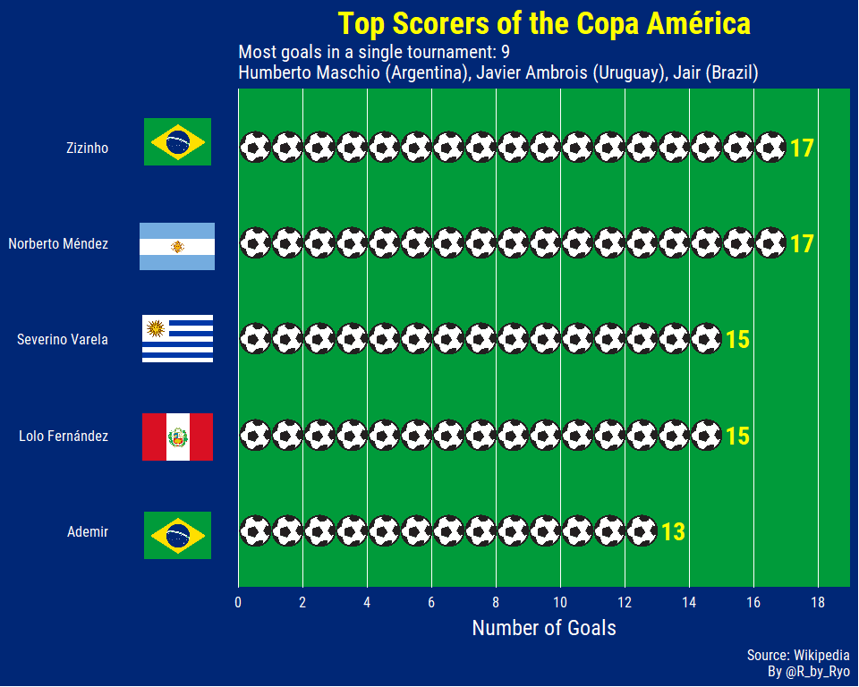
Most of these players aren’t ones you might recognize. The Copa América used to be held a lot more regularly (and sometimes erratically) until this century so players had a lot more opportunities to score goals. All five of the players you see here played in the 1930s-1950s when there was a tournament every one or two years. Out of currently active players, Peruvian legend Paolo Guerrero has 11 goals along with Eduardo Vargas (from Chile) with 10. (Edit: after the Chile - Japan game, Vargas is on 12…) Another player you might recognize that was actually tied with Ademir for 5th place, along with three other players, was Gabriel Batistuta (“Batigol”).
Winners of the Copa América
After grabbing the data from the Wikipedia page I used a variety of
functions to clean and reshape the dataset like tidyr::separate() to
split the number of occurences and the year.
url <- "https://es.wikipedia.org/wiki/Anexo:Estad%C3%ADsticas_de_la_Copa_Am%C3%A9rica"

session <- bow(url)

copa_campeones <- scrape(session) %>%
  html_nodes(".mw-parser-output > table:nth-child(10)") %>%
  html_table() %>%
  flatten_df()

copa_campeones_limpia <- copa_campeones %>%
  janitor::clean_names() %>%
  slice(1:8) %>%
  select(1:4) %>%
  set_names(c("team", "winners", "runners_up", "third_place")) %>%
  separate(winners, into = c("Champions", "first_place_year"),
           sep = " ", extra = "merge") %>%
  separate(runners_up, into = c("Runners-up", "second_place_year"),
           sep = " ", extra = "merge") %>%
  separate(third_place, into = c("Third Place", "third_place_year"),
           sep = " ", extra = "merge") %>%
  mutate_all(list(~str_replace_all(., "–", "0"))) %>%
  mutate_at(vars(contains("num")), funs(as.numeric)) %>%
  gather(key = "key", value = "value", -team,
         -first_place_year, -second_place_year, -third_place_year) %>%
  mutate(key = as.factor(key),
         value = as.numeric(value),
         team = team %>% str_replace(., "[A-Z]{3}", "") %>% str_trim(.),
         team = case_when(team == "Brasil" ~ "Brazil",
                          TRUE ~ team)) %>%
  mutate(key = forcats::fct_relevel(key,
                                    "Champions",
                                    "Runners-up",
                                    "Third Place")) %>%
  arrange(key, desc(value)) %>%
  mutate(team = forcats::as_factor(team),
         order = row_number())
I also wanted to add flags to this plot but
cowplot::insert_yaxis_grob() is unfortunately not compatible with
facets. I used stringr::str_wrap() to format the subtitle nicely while
I used glue::glue() to avoid having the use ‘\n’ to create a new line
for the caption.
copa_ganadores_plot <- copa_campeones_limpia %>%
  ggplot(aes(value, forcats::fct_rev(team), color = key)) +
  geom_point(size = 10) +        # 10
  geom_text(aes(label = value),
            size = 5, color = "black",    # 5
            family = "Roboto Condensed", fontface = "bold") +
  scale_color_manual(values = c("Champions" = "#FFCC33",
                                "Runners-up" = "#999999",
                                "Third Place" = "#CC6600"),
                     guide = FALSE) +
  scale_x_continuous(breaks = c(1, 5, 10, 15),
                     labels = c(1, 5, 10, 15),
                     limits = c(-1, 16)) +
  labs(x = "Number of Occurrence", y = NULL,
       title = "Most Successful Teams of the Copa América!",
       subtitle = str_wrap("Ordered by number of Copa América(s) won. Argentina missed the chance to leapfrog Uruguay after consecutive final losses in the previous two tournaments!", width = 80),
       caption = glue("
                      Source: Wikipedia
                      By @R_by_Ryo")) +
  facet_wrap(~key) +
  theme_copaAmerica(subtitle.size = 14,
                    caption.size = 10)

copa_ganadores_plot
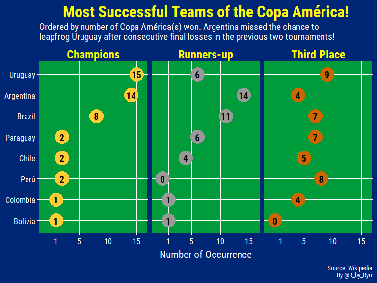
What’s surprising to note is that Pele never won a Copa América with Brazil, although he did get Best Player and Top Scorer in the 1959 edition of the tournament. Even more bizarrely Diego Maradona has never won it either! He didn’t play in either of the 1991 and 1993 editions where Argentina won their 13th and 14th Copas.
Copa América Squad Profiles
We just looked at what happened in the past but who are the players competing in the tournament this year? To take a quick look I web-scraped the squads of each of the competing teams from Wikipedia.
I created a list of the xpaths for each of squads and using
purrr::map() I grabbed the data for each participating country. After
I got some meta-information about the country name and the group I
created a list-column that stores the squad data as a dataframe in its
own column. To explode this out I used tidyr::unnest() to reshape the
entire dataframe to have one row with all the data for each player in
every squad.
To get a clean dataset I use some stringr::str_*() functions to
properly format the character strings such as the player positions,
ages, date of births.
squads_df_clean <- squads_df_raw %>%
  janitor::clean_names() %>%
  select(-delete, squad_num = no,
         position = pos, birth_age = date_of_birth_age) %>%
  mutate(position = position %>% str_replace_all(., "[1-9]", ""),
         birth_age = birth_age %>% str_extract_all(., pattern = "\\([^()]+\\)")) %>%   unnest(birth_age) %>%
  group_by(player) %>%
  mutate(colnum = seq_along(player)) %>%
  spread(key = colnum, value = birth_age) %>%
  ungroup() %>%
  select(everything(), dob = `1`, age = `2`) %>%
  mutate(dob = dob %>% str_replace_all(., "[()]", "") %>% lubridate::as_date(),
         age = age %>% str_extract(., "[0-9]+") %>% as.integer,
         country = forcats::fct_relevel(country,
                                    "Brazil", "Argentina", "Uruguay",
                                    "Peru", "Qatar", "Chile",
                                    "Venezuela", "Paraguay", "Japan",
                                    "Bolivia", "Colombia", "Ecuador",
                                    ),
         club = case_when(
           club == "Barcelona" & country == "Ecuador" ~ "Barcelona (Ecuador)",
           TRUE ~ club))
glimpse(squads_df_clean)
## Observations: 276
## Variables: 12
## $ name           <int> 3, 3, 3, 3, 3, 3, 3, 3, 3, 3, 3, 3, 3, 3, 3, 3,...
## $ group          <chr> "A", "A", "A", "A", "A", "A", "A", "A", "A", "A...
## $ country        <fct> Brazil, Brazil, Brazil, Brazil, Brazil, Brazil,...
## $ squad_num      <int> 1, 2, 3, 4, 5, 6, 7, 8, 9, 10, 11, 12, 13, 14, ...
## $ position       <chr> "GK", "DF", "DF", "DF", "MF", "DF", "FW", "MF",...
## $ player         <chr> "Alisson", "Thiago Silva", "Miranda", "Marquinh...
## $ caps           <int> 36, 79, 57, 36, 36, 40, 3, 10, 29, 65, 49, 15, ...
## $ goals          <int> 0, 7, 3, 1, 0, 2, 1, 0, 16, 8, 14, 1, 7, 0, 0, ...
## $ club           <chr> "Liverpool", "Paris Saint-Germain", "Internazio...
## $ country_league <chr> "England", "France", "Italy", "France", "Spain"...
## $ dob            <date> 1992-10-02, 1984-09-22, 1984-09-07, 1994-05-14...
## $ age            <int> 26, 34, 34, 25, 27, 33, 22, 22, 22, 30, 27, 28,...
Age-histogram
Using this data I can plot a bunch of histograms:
age_country_plot <- squads_df_clean %>%
  group_by(country) %>%
  mutate(median_age = median(age)) %>%
  ungroup() %>%
  ggplot(aes(x = age)) +
  geom_histogram(fill = "red", binwidth = 1) +
  geom_vline(aes(xintercept = median_age), size = 1.2) +
  geom_label(aes(x = median_age, y = 8,
                label = glue::glue("Median: {median_age}")),
            nudge_x = 0.5, hjust = 0.1, size = 3,
            family = "Roboto Condensed", color = "black") +
  labs(title = "Age Distribution of Copa América squads",
       subtitle = "Columns ordered Group A to Group C",
       x = "Age", y = NULL,
       caption = glue::glue("
                            Source: Wikipedia
                            By: @R_by_Ryo")) +
  scale_x_continuous(expand = c(0, 0)) +
  scale_y_continuous(expand = c(0, 0),
                     breaks = scales::pretty_breaks()) +
  theme_copaAmerica(title.size = 22,
                    subtitle.size = 14,
                    caption.size = 8,
                    axis.text.size = 12,
                    axis.title.size = 16,
                    strip.text.size = 18,
                    panel.grid.minor.x = element_line(color = "white"),
                    panel.grid.minor.y = element_line(color = "white")) +
  facet_wrap(~country, ncol = 3)

age_country_plot
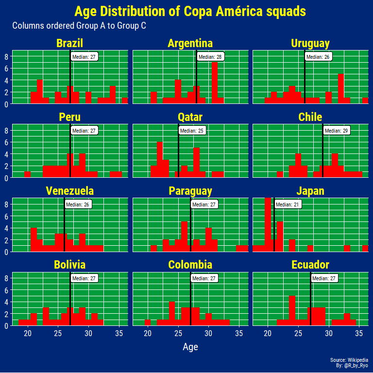
In terms of age, Japan have the youngest team with a median of 21, 4 years younger than the next youngest team, Qatar. The rest have a fairly balanced spread of ages from 20 to early-mid 30s with most of the medians hovering around 27 years of age. The reason for Japan’s extremely young squad is due to the fact that the full-strength Japan team has played in both the World Cup and the Asian Cup in the past year. Along with the fact that the Tokyo Olympics are next year, it was decided to use the invitation to the Copa América as a trial-by-fire for the young stars of the future. Much like in a real Olympic squad, the team contains three “overage” players in World Cup 2010/2014/2018 goalkeeper Eiji Kawashima, Premier League winner Shinji Okazaki, and Getafe playmaker Gaku Shibasaki.
The oldest player will be Brazil captain Dani Alves at 36 with Paraguay’s Oscar Cardozo only two weeks younger. On the other hand, the youngest player is Japan’s 18-year old prodigy Takefusa Kubo, the ex-Barcelona youth player who only just recently moved to Real Madrid! In light of his transfer a lot of eyes will be on him to see if he can produce some Captain Tsubasa-esque performances for a very inexperienced Japan team gearing up for the Tokyo Olympics!
Caps histogram
When considering the experience of a squad it’s not enough to look at ages but one needs to look at the caps or appearances for the national team as well.
caps_country_plot <- squads_df_clean %>%
  group_by(country) %>%
  mutate(median_cap = median(caps)) %>%
  ungroup() %>%
  ggplot(aes(x = caps)) +
  geom_histogram(fill = "red", binwidth = 5) +
  geom_vline(aes(xintercept = median_cap), size = 1.25) +
  geom_label(aes(x = median_cap, y = 15,
                label = glue::glue("Median: {median_cap}")),
            nudge_x = 0.5, hjust = 0.05, size = 3,
            family = "Roboto Condensed", color = "black") +
  labs(title = "Caps (Appearances) by Country",
       subtitle = "Columns ordered Group A to Group C",
       x = "Caps", y = NULL,
       caption = glue::glue("
                            Source: Wikipedia
                            By: @R_by_Ryo")) +
  scale_x_continuous(expand = c(0, 0)) +
  scale_y_continuous(expand = c(0, 0)) +
  theme_copaAmerica(
    title.size = 20,
    subtitle.size = 14,
    caption.size = 10,
    axis.text.size = 10,
    axis.title.size = 16,
    strip.text.size = 18,
    panel.grid.major.x = element_line(color = "white", size = 0.25),
    panel.grid.major.y = element_line(color = "white", size = 0.25),
    panel.grid.minor.x = element_line(color = "white", size = 0.25),
    panel.grid.minor.y = element_line(color = "white", size = 0.25)) +
  facet_wrap(~country, ncol = 3)

caps_country_plot
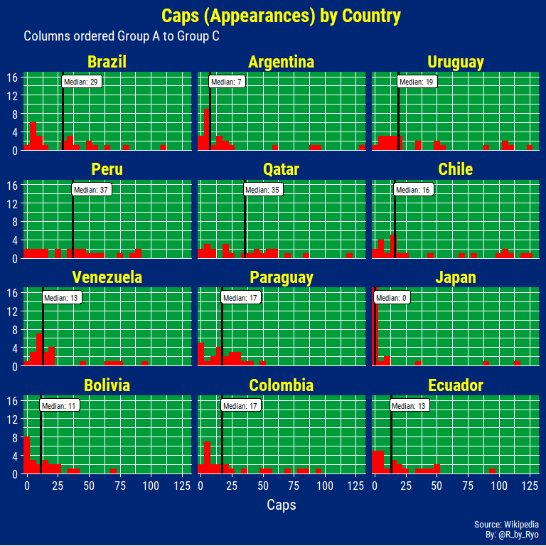
The majority of Japan’s squad have 0 (ZERO) caps, with the aforementioned three “overage” players taking up most of the proportion of caps on the team. Bolivia are also taking a untested squad with 8 of their players with 2 caps or less! Chile, Uruguay, and Argentina bring their veterans with multiple players over or around 100 caps. From this data I was surprised that Jefferson Farfan and Paolo Guerrero didn’t have 100 caps by now…
The player with the most caps is Lionel Messi (130) followed closely by Diego Godin (126), and Alexis Sanchez (124). On the other hand there are 29 players hopeful of making their first national team appearance at this tournament with the majority (17 players) coming from Japan.
Goal distribution
Next I looked at the distribution of goals scored by the midfielders and
strikers of each team. I found out about using
ggplot2::position_nudge() for slightly adjusting variables on a
discrete scale in similar fashion to the nudge_y = and nudge_x =
arguments most people might be familiar with from other geoms. I also
used ggforce::geom_mark_hull() to do some labelling.
goals_country_plot <- squads_df_clean %>%
  filter(position %in% c("MF", "FW")) %>%
  group_by(country) %>%
  mutate(median = median(goals)) %>%
  ungroup() %>%
  ggplot(aes(x = goals, y = reorder(country, median))) +
  ggridges::geom_density_ridges(fill = "red", color = "white", scale = 1.1) +
  geom_point(aes(x = median, y = country), position = position_nudge(y = 0.25),
             color = "yellow", size = 3) +
  ggforce::geom_mark_hull(aes(filter = country == "Argentina" & goals == 67, label = "Lionel Messi: 67 goals"),
                          label.buffer = unit(15, "mm"), label.fontsize = 10, label.fill = "red",
                          label.family = "Roboto Condensed", label.colour = "white",
                          con.cap = unit(1, "mm"), con.type = "straight") +
  ggforce::geom_mark_hull(aes(filter = country == "Uruguay" & goals == 55, label = "Luis Suarez: 55 goals"),
                          label.buffer = unit(5, "mm"), label.fontsize = 10, label.fill = "red",
                          label.family = "Roboto Condensed", label.colour = "white",
                          con.cap = unit(1, "mm"), con.type = "straight") +
  ggforce::geom_mark_hull(aes(filter = country == "Japan" & goals == 50, label = "Shinji Okazaki: 50 goals"),
                          label.buffer = unit(2, "mm"), label.fontsize = 10, label.fill = "red",
                          label.family = "Roboto Condensed", label.colour = "white",
                          con.cap = unit(1, "mm"), con.type = "straight") +
  ggforce::geom_mark_hull(aes(filter = country == "Uruguay" & goals == 46, label = "Edinson Cavani: 46 goals"),
                          label.buffer = unit(25, "mm"), label.fontsize = 10, label.fill = "red",
                          label.family = "Roboto Condensed", label.colour = "white",
                          con.cap = unit(1, "mm"), con.type = "straight") +
  ggforce::geom_mark_hull(aes(filter = country == "Chile" & goals == 41, label = "Alexis Sanchez: 41 goals"),
                          label.buffer = unit(4, "mm"), label.fontsize = 10, label.fill = "red",
                          label.family = "Roboto Condensed", label.colour = "white",
                          con.cap = unit(1, "mm"), con.type = "straight") +
  scale_x_continuous(limits = c(0, 73),
                     expand = c(0.01, 0.01),
                     breaks = c(0, 5, 10, 15, 20, 25, 30, 35, 40, 45, 50, 55, 60, 65, 70),
                     labels = c(0, 5, 10, 15, 20, 25, 30, 35, 40, 45, 50, 55, 60, 65, 70)) +
  expand_limits(y = 13.5) +
  labs(title = "Distribution of Goals Scored by Midfielders and Strikers",
       subtitle = "Copa América 2019 squads, Yellow dot = Median goals",
       x = "Goals", y = NULL,
       caption = glue::glue("
                            Source: Wikipedia
                            Data from prior to start of tournament
                            By: @R_by_Ryo")) +
  theme_copaAmerica(title.size = 18,
                    subtitle.size = 12,
                    caption.size = 8,
                    axis.text.size = 14,
                    axis.title.size = 16,
                    strip.text.size = 18)

goals_country_plot
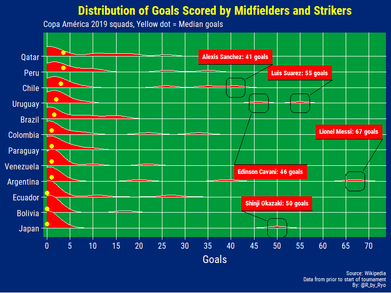
With a lot of these players being more defensively minded or new players the distribution is heavily skewed but you can see little mounds showing the top goalscorers for each country and see which countries have their goalscorers spread out among multiple players such as Brazil, Qatar, and Peru.
If you know your South American players you can take a good guess at who are the top goal scorers for each nation. For Colombia the two outlying mounds are obviously James Rodriguez and Falcao, for example. Venezuela’s top scorer with 22 is Salomon Rondon and for Brazil, if not for his injury, a lonesome mound would have appeared for Neymar with 60 goals!
Player contribution by league
Now let’s check the player contribution to the squads at the Copa
América by league. I’m just going to use the country that the league is
from for simplicity’s sake. Originally I wanted to left_join() it with
a ‘country <> domestic league’ table but couldn’t find one and the
league names itself aren’t very meaningful or have awful sponsor names
that obfuscate the country of origin even further.
player_contrib_league_plot <- squads_df_clean %>%
  group_by(country_league) %>%
  summarize(n = n()) %>%
  ungroup() %>%
  ggplot(aes(y = n, x = reorder(country_league, n))) +
  geom_col(fill = "red") +
  geom_text(aes(label = n, family = "Roboto Condensed", fontface = "bold"),
            size = 4.5, color = "yellow",
            nudge_y = 0.5) +
  coord_flip() +
  scale_y_continuous(labels = c(0, 5, 10, 15, 20, 25),
                     breaks = c(0, 5, 10, 15, 20, 25),
                     limits = c(0, 30),
                     expand = c(0, 0)) +
  labs(title = "Breakdown of Player Contributions by League",
       subtitle = glue("
                       Shown as Country Name
                       Mexico (Liga MX) contributed 27 players to South American squads"),
       x = "League (Country name)", y = "Number of players",
       caption = glue::glue("
                            Source: Wikipedia
                            By: @R_by_Ryo")) +
  theme_copaAmerica(title.size = 18,
                    subtitle.size = 12,
                    caption.size = 10,
                    axis.text.size = 14,
                    axis.text.y.size = 11,
                    axis.title.size = 16,
                    panel.grid.major.y = element_blank(),
                    panel.grid.minor.x = element_line(color = "white"))

player_contrib_league_plot
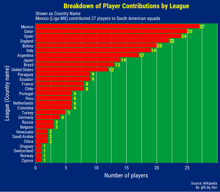
The best of the best players from South American countries will move on to Europe so the Argentinean league (Superliga Argentina) and the Brazilian league (Brasileirão - Serie A) do not have as many players as you might think and as a consequence, the top leagues of England, Spain, and Italy contribute quite a bit! A lot of the better players but not quite elite South American players might go to Mexico instead of a lower-mid European league. With the growth of the MLS a fair number of players ply their trade there as well.
We can take a more detailed look by creating a table of the proportion
of players from each squad coming from either a domestic league or any
other league. I had to do a lot of wrangling to get the proper output
for the table. After calculating the percentage of domestic players from
a country’s domestic league I added the full data back in. Then I had to
make sure that for each country, the country - domestic league country
was the first row in each of the country groups (so Bolivia - Bolivia,
Bolivia, China, Japan - Japan, Japan - England, etc.). By doing this I
can automatically tidyr::fill()-in the rest of the rows of that
country with the ‘percentage of players from domestic league stat’.
squads_df_clean %>%
  group_by(country, country_league) %>%
  summarize(player_from_league = n()) %>%
  filter(country == country_league) %>%
  mutate(perc_from_domestic_league = percent(player_from_league / 23, accuracy = 0.1)) %>%
  right_join(squads_df_clean %>%
              group_by(country, country_league) %>%
              summarize(player_from_league = n()) %>%
              ungroup()) %>%
  mutate(first = case_when(
    country == country_league ~ 1,
    TRUE ~ 0)) %>%
  arrange(country, desc(first)) %>%
  fill(perc_from_domestic_league) %>%
  group_by(country) %>%
  mutate(perc_from_league = percent(player_from_league / 23, accuracy = 0.1),
         country_league = glue::glue("{country_league} - league")) %>%
  arrange(desc(player_from_league)) %>%
  select(Country = country, `League (country name)` = country_league,
         `Number of players from league` = player_from_league,
         `Percentage of players from league` = perc_from_league,
         `Percentage of players from domestic league` = perc_from_domestic_league) %>%
  head(10) %>%
  knitr::kable(format = "html",
               caption = "Breakdown of Player Contribution by League") %>%
  kableExtra::kable_styling(full_width = FALSE)
| Country | League (country name) | Number of players from league | Percentage of players from league | Percentage of players from domestic league |
|---|---|---|---|---|
| Qatar | Qatar - league | 23 | 100.0% | 100.0% |
| Bolivia | Bolivia - league | 20 | 87.0% | 87.0% |
| Japan | Japan - league | 14 | 60.9% | 60.9% |
| Ecuador | Ecuador - league | 9 | 39.1% | 39.1% |
| Paraguay | Paraguay - league | 8 | 34.8% | 34.8% |
| Brazil | England - league | 7 | 30.4% | 13.0% |
| Uruguay | Spain - league | 6 | 26.1% | 4.3% |
| Peru | Peru - league | 6 | 26.1% | 26.1% |
| Chile | Chile - league | 6 | 26.1% | 26.1% |
| Argentina | Argentina - league | 5 | 21.7% | 21.7% |
Three interesting facts I found:
- 30% of players on the Brazil squad play for an English team, most out of any league - squad combination excluding domestic leagues.
- 100% of the Qatar squad play in their domestic league!
- Only one Uruguayan player (4.3%) plays in its domestic league.
Player contribution by club
In the final plot for this section, I looked at the top 10 clubs
contributing the most players to the tournament. I used
arrange(desc(n)) %>% slice() instead of top_n() as sometimes top_n() grabs
way too many teams that are tied with the same value. To set the team names inside the bars I
created a midpoint value midval that calculated a value half of the
number of players contributed so the labels were placed neatly.
player_contrib_club_plot <- squads_df_clean %>%
  group_by(club) %>%
  summarize(n = n()) %>%
  mutate(club = club %>% forcats::as_factor() %>% forcats::fct_reorder(n),
         midval = n / 2) %>%
  arrange(desc(n)) %>%
  slice(1:15) %>%
  ggplot(aes(x = club, y = n)) +
  geom_col(fill = "red") +
  geom_text(aes(label = n, family = "Roboto Condensed", fontface = "bold"),
            size = 7.5, color = "yellow",
            nudge_y = 0.5) +
  geom_text(aes(y = midval, label = club,
                family = "Roboto Condensed", fontface = "bold"),
            size = 5, color = "white") +
  coord_flip() +
  scale_y_continuous(breaks = scales::pretty_breaks(),
                     expand = c(0, 0),
                     limits = c(0, 10.5)) +
  labs(title = "Top 15 Clubs contributing the most players to the Copa América",
       x = "Club", y = "Number of players",
       caption = "Source: Wikipedia") +
  theme_copaAmerica(
    title.size = 18,
    subtitle.size = 12,
    caption.size = 8,
    axis.text.size = 14,
    axis.title.size = 16,
    strip.text.size = 18,
    panel.grid.major.y = element_blank(),
    panel.grid.minor.x = element_line(color = "white")) +
  theme(axis.text.y = element_blank(),
        axis.ticks.y = element_blank())

player_contrib_club_plot
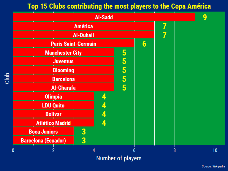
With 100% of its players coming from the domestic league it’s not surprise that the Qatari team, Al-Sadd, is contributing the most players to the tournament. Tied with another Qatari team, Mexican club America features 7 players yet none of them are Mexicans (2 Argentineans, 2 Colombians, 1 Ecuadorian, 1 Chilean, and 1 Paraguayan).
At first I thought Barcelona contributed 8 players until I realized the Ecuadorian players were coming from the Ecuadorian team called Barcelona…I had to go all the way back up to the beginning of this section to fix that small peculiarity. As futbol came to South America via European colonists and immigrants a lot of teams took up the names and colors of the teams these Europeans were fond of. Other examples include Liverpool F.C. (Montevideo, Uruguay), Arsenal de Sarandi (Buenos Aires, Argentina), and Club Atletico Juventus (Sao Paulo, Brazil - although they use the colors of Torino F.C.).
If you download the data and type in the code below you can see the entire club-country list.
squads_df_clean %>%
    group_by(club, country) %>%
    summarize(n = n()) %>% View()
Match Records
Now that we got a good look at the composition of the teams, we can take a look at how they’ve done at every Copa América.
The next code chunk mainly comes from PH Julien and his excellent Kaggle kernel of “A Journey Through The History of Soccer”.
## grab football federation affiliations data
federation_files <- Sys.glob("../data/federation_affiliations/*")

df_federations = data.frame(country = NULL, federation = NULL)
for (f in federation_files) {
    federation = basename(f)
    content = read.csv(f, header=FALSE)
    content <- cbind(content,federation=rep(federation, dim(content)[1]))
    df_federations <- rbind(df_federations, content)
}

colnames(df_federations) <- c("country", "federation")

df_federations <- df_federations %>%
  mutate(country = as.character(country) %>% str_trim(side = "both"))

results_raw <- readr::read_csv("../data/results.csv")

results_copa <- results_raw %>%
  filter(tournament == "Copa América") %>%
  rename(venue_country = country,
         venue_city = city) %>%
  mutate(match_num = row_number())

## combine with federation affiliations
results_copa_home <- results_copa %>%
  left_join(df_federations,
            by = c("home_team" = "country")) %>%
  mutate(federation = as.character(federation)) %>%
  rename(home_federation = federation)

results_copa_away <- results_copa %>%
  left_join(df_federations,
            by = c("away_team" = "country")) %>%
  mutate(federation = as.character(federation)) %>%
  rename(away_federation = federation)

## combine home-away
results_copa_cleaned <- results_copa_home %>%
  full_join(results_copa_away)
Unfortunately, this data does not have penalty results as those games are all counted as a draw (as technically that is the actual result). Considering there a lot of cagey knock-out rounds that finish in a penalty shoot-out (including the last two finals…) it is unfortunate but that’s just the data you have sometimes. There is a way to web-scrape all the Copa América results and assign Win-Lose to those games that went to penalties but I’ll leave that for another time. Also, there is no info on what stage of the tournament the match recorded is in.
results_copa_cleaned <- results_copa_cleaned %>%
  mutate(
    home_federation = case_when(
      home_team == "USA" ~ "Concacaf",
      TRUE ~ home_federation),
    away_federation = case_when(
      away_team == "USA" ~ "Concacaf",
      TRUE ~ away_federation)) %>%
  select(-contains("federation"), -contains("venue"),
         -neutral, date, home_team, home_score, away_team, away_score,
         tournament, venue_city)
glimpse(results_copa_cleaned)
## Observations: 787
## Variables: 8
## $ date       <date> 1916-07-02, 1916-07-06, 1916-07-08, 1916-07-10, 19...
## $ home_team  <chr> "Chile", "Argentina", "Brazil", "Argentina", "Brazi...
## $ away_team  <chr> "Uruguay", "Chile", "Chile", "Brazil", "Uruguay", "...
## $ home_score <dbl> 0, 6, 1, 1, 1, 0, 4, 4, 1, 4, 5, 1, 6, 2, 0, 3, 4, ...
## $ away_score <dbl> 4, 1, 1, 1, 2, 0, 0, 2, 0, 0, 0, 0, 0, 3, 2, 1, 1, ...
## $ tournament <chr> "Copa América", "Copa América", "Copa América", "Co...
## $ match_num  <int> 1, 2, 3, 4, 5, 6, 7, 8, 9, 10, 11, 12, 13, 14, 15, ...
## $ venue_city <chr> "Buenos Aires", "Buenos Aires", "Buenos Aires", "Bu...
Now that it’s nice and cleaned up I created a function that reshapes the
data so that it’s set from a certain team’s perspective with the “team”
argument. You can also set the function to look for only results against
a certain opponent by filling in the versus argument.
copaAmerica_resultados <- function(data, team, versus = NA) {

  ## team of interest: ex. 'Brazil'
  team_var <- enquo(team)

  todos_partidos <- data %>%
    ## filter only for results of team of interest
    filter(home_team == !!team_var | away_team == !!team_var) %>%
    ## reshape columns to team vs. opponent
    mutate(
      opponent = case_when(
        away_team != !!team_var ~ away_team,
        home_team != !!team_var ~ home_team),
      home_away = case_when(
        home_team == !!team_var ~ "home",
        away_team == !!team_var ~ "away"),
      equipo_goals = case_when(
        home_team == !!team_var ~ home_score,
        away_team == !!team_var ~ away_score),
      opp_goals = case_when(
        home_team != !!team_var ~ home_score,
        away_team != !!team_var ~ away_score)) %>%
    ## label results from team's perspective
    mutate(
      result = case_when(
        equipo_goals > opp_goals ~ "Win",
        equipo_goals < opp_goals ~ "Loss",
        equipo_goals == opp_goals ~ "Draw")) %>%
    mutate(result = result %>% forcats::as_factor() %>% forcats::fct_relevel(c("Win", "Draw", "Loss"))) %>%
    select(-contains("score"), -contains("team"), -match_num) %>%
    rename(Date = date, Tournament = tournament, `Venue` = venue_city, Opponent = opponent, `Home / Away` = home_away,
           `Goals For` = equipo_goals, `Goals Against` = opp_goals, Result = result)

  if (is.na(versus) | is.null(versus)) {

    resultados_totalmente <- todos_partidos %>%
      group_by(Result, Opponent) %>%
      mutate(n = n()) %>%
      ungroup() %>%
      ## sum amount of goals by team and opponent
      group_by(Result, Opponent) %>%
      summarize(e_g = sum(`Goals For`),
                o_g = sum(`Goals Against`),
                n = n()) %>%
      ungroup() %>%
      ## spread results over multiple columns
      spread(Result, n) %>%
      mutate_if(is.integer, as.numeric)

    missing_cols <- c("Win", "Draw", "Loss") %>%
      map_dfr( ~tibble(!!.x := numeric()))

    resultados_totalmente <- resultados_totalmente %>%
      bind_rows(missing_cols) %>%
      mutate(Win = if_else(is.na(Win), 0, Win),
             Draw = if_else(is.na(Draw), 0, Draw),
             Loss = if_else(is.na(Loss), 0, Loss)) %>%
      group_by(Opponent) %>%
      summarize(Win = sum(Win, na.rm = TRUE),
                Draw = sum(Draw, na.rm = TRUE),
                Loss = sum(Loss, na.rm = TRUE),
                `Goals For` = sum(e_g),
                `Goals Against` = sum(o_g))

    return(list(resultados_totalmente, todos_partidos))
  } else {
    ## opponent: ex. 'Argentina'
    todos_partidos <- todos_partidos %>%
      filter(Opponent == versus)

    if (nrow(todos_partidos) == 0) {
     return(glue("{team} has never played {versus} at the Copa América!"))
    } else {

    resultados_totalmente <- todos_partidos %>%
      group_by(Result, Opponent) %>%
      mutate(n = n()) %>%
      ungroup() %>%
      # sum amount of goals by team and opponent
      group_by(Result, Opponent) %>%
      summarize(e_g = sum(`Goals For`),
                o_g = sum(`Goals Against`),
                n = n()) %>%
      ungroup() %>%
      # spread results over multiple columns
      spread(Result, n) %>%
      mutate_if(is.integer, as.numeric) %>%
      group_by(Opponent) %>%
      summarize(Win = sum(Win, na.rm = TRUE),
                Draw = sum(Draw, na.rm = TRUE),
                Loss = sum(Loss, na.rm = TRUE),
                `Goals For` = sum(e_g),
                `Goals Against` = sum(o_g))

    return(list(resultados_totalmente, todos_partidos))
    }
  }
}
The output is either a dataframe of all the games a team has been involved in as well as the record of the team against other teams in the Copa América or a message saying that the team you picked has never played against the opponent you picked.
Japan
copaAmerica_resultados(data = results_copa_cleaned,
               team = "Japan", versus = "Brazil")
## Japan has never played Brazil at the Copa América!
Oh… that’s right Japan has never played against Brazil at the Copa…
resultados_japon <- copaAmerica_resultados(data = results_copa_cleaned, team = "Japan")

resultados_japon[[2]] %>%
  knitr::kable(format = "html",
               caption = "Japan's record in the Copa América") %>%
  kableExtra::kable_styling(full_width = FALSE)
| Date | Tournament | Venue | Opponent | Home / Away | Goals For | Goals Against | Result |
|---|---|---|---|---|---|---|---|
| 1999-06-29 | Copa América | Asunción | Peru | away | 2 | 3 | Loss |
| 1999-07-02 | Copa América | Asunción | Paraguay | away | 0 | 4 | Loss |
| 1999-07-05 | Copa América | Pedro Juan Caballero | Bolivia | away | 1 | 1 | Draw |
Japan’s only previous journey to the Copa América was in the 1999 edition where they lost all 2 games and drew against Bolivia. They were also invited for the 2011 edition but withdrew due to the Tohoku Earthquake and were replaced by Costa Rica. Japanese football has come a long way since 1999 but with a young squad this tournament it will be a uphill battle to get 3 points against any of their Group C opponents, Uruguay, Chile, and Ecuador.
Colombia
resultados_colombia <- copaAmerica_resultados(data = results_copa_cleaned, team = "Colombia")

resultados_colombia[[2]] %>%
  slice(87:92) %>%
  knitr::kable(format = "html",
               caption = "Colombia's record in the Copa América") %>%
  kableExtra::kable_styling(full_width = FALSE)
| Date | Tournament | Venue | Opponent | Home / Away | Goals For | Goals Against | Result |
|---|---|---|---|---|---|---|---|
| 2001-07-11 | Copa América | Barranquilla | Venezuela | home | 2 | 0 | Win |
| 2001-07-14 | Copa América | Barranquilla | Ecuador | home | 1 | 0 | Win |
| 2001-07-17 | Copa América | Barranquilla | Chile | home | 2 | 0 | Win |
| 2001-07-23 | Copa América | Armenia | Peru | home | 3 | 0 | Win |
| 2001-07-26 | Copa América | Manizales | Honduras | home | 2 | 0 | Win |
| 2001-07-29 | Copa América | Bogotá | Mexico | home | 1 | 0 | Win |
Despite a recent resurgence of the Colombia national team they have not been able to match the feats of the 2001 side that won the Copa with their best place finish since then coming 3rd in 2004. The 2001 team were not only unbeaten but also did not concede a single goal throughout the tournament!
Superclásico Sudamericano: Brazil vs. Argentina
resultados_de_brazil <- copaAmerica_resultados(data = results_copa_cleaned,
               team = "Brazil", versus = "Argentina")

resultados_de_brazil[[1]] %>%
  knitr::kable(format = "html",
               caption = "Brazil vs. Argentina in the Copa América") %>%
  kableExtra::kable_styling(full_width = FALSE)
| Opponent | Win | Draw | Loss | Goals For | Goals Against |
|---|---|---|---|---|---|
| Argentina | 9 | 8 | 15 | 38 | 52 |
resultados_de_brazil[[2]] %>%
  tail(5) %>%
  knitr::kable(format = "html",
               caption = "Brazil vs. Argentina in the Copa América") %>%
  kableExtra::kable_styling(full_width = FALSE)
| Date | Tournament | Venue | Opponent | Home / Away | Goals For | Goals Against | Result |
|---|---|---|---|---|---|---|---|
| 1993-06-27 | Copa América | Guayaquil | Argentina | home | 1 | 1 | Draw |
| 1995-07-17 | Copa América | Rivera | Argentina | home | 2 | 2 | Draw |
| 1999-07-11 | Copa América | Ciudad del Este | Argentina | home | 2 | 1 | Win |
| 2004-07-25 | Copa América | Lima | Argentina | away | 2 | 2 | Draw |
| 2007-07-15 | Copa América | Maracaibo | Argentina | home | 3 | 0 | Win |
Brazil does not have a good overall record vs. Argentina but they have not lost against their rivals at the Copa América since the 1993 edition where they lost 5-6 on penalties in the Quarter Finals. The “draw” in 1995 was won on penalties while the “draw” in 2004 was actually in the final where they won 4-2 on penalties.
What I found odd was that the Copa América seems to have a very low priority to certain countries, especially Brazil who have repeatedly sent their B or C teams to the tournament in favor of sending their best team to other tournaments or resting star players. Funnily enough these understrength Brazilian squads have actually won the entire tournament a few times, most notably in 2007 against a full strength Argentina side containing the likes of Zanetti, Riquelme, Cambiasso, Tevez, a young Messi/Mascherano, Cambiasso, et al!
Player Profiles
After looking at the history of the competition and the composition of the squads I examined the players and their form coming into the Copa América. In recent years football analytics has really taken off and there have been many strides made in creating more informative statistics to assess players’ abilities, the most prominently being the xG statistics. This is the first time I talk about xG in any length/depth so this introduction is as much to solidify my understanding as well as yours!
What IS xG?
-
xG: Quantitative measure (between 0 and 1) that assigns a probability that a shot taken will result in a goal based on a variety of variables and is used for evaluating the quality of chances and predicting players’ and teams’ future performances.
-
xA: Quantitative measure (between 0 and 1) that assigns a probability that a given pass will result in an assist for a goal based on a variety of variables.
Common variables used in the models that output xG statistics are the distance and angle of a shot, the body part used, rebound, among others. Similar to how you might assess your favorite striker’s chances of scoring just as he is lining up to take a shot: Is the shot a header? Is he trying to score from a cross in regular play or a corner kick? Are there a crowd of defenders in front of him or is he one-on-one with the goalkeeper? Etc. You might think who is taking the shot would be a genuine factor but in actuality it tells you a lot less about the chances of a goal compared to the location of the shot.
Note that there isn’t a SINGLE xG model. You can check out a blog post comparing different people’s xG models here. People and organizations (from Statsbomb to OptaPro) have their own ideas about what could be the important variables in play and as such it’s important to report from which source you got your data from as the stats can differ between models. A few things xG does not factor in are things like goalkeeper performance (someone pulling off incredible saves or letting in a poor shot) and one must also consider the fact that team style of play and the quality of a player’s teammates. When judging players based on these stats it is important to be aware of contextual factors like the team they play for, their opponent, and the player’s position/role in the team.
From xG and xA more granular statistics such as xGChain and xGBuildup were created to be able to dig a little deeper into who is contributing to chance creation, I’ll introduce the latter two a bit later. As the field has grown new statistics have popped up such as Karun Singh’s “expected threat” or xT. You can check out an introduction to xT from here.
Of course, these statistics only tell a part of the story and are definitenly not the be-all-and-end-all. In the context of this current blog post, these stats only tell the story about how these players did for their club teams this past season rather than for their national team. Even still it gives us a good idea of what kind of form these players are in coming into this tournament.
You might also want to watch these Youtube videos by TifoFootball for a quick primer on xG and xA.
understat data
For the data I used the website, understat.com. Their xG models were
created via training a neural network on a dataset consisting of over
100,000 shots using more than 10 different variables. Getting data from
understat has been made easy by Ewen Henderson’s understatr package
available from Github (he’s also
the guy that made the ghibli color
palette!). I tried to pick a wide selection of attacking players but I
was also limited by the fact that understat only has data for
teams/players from six European leagues (Premier League, Bundesliga,
Serie A, La Liga, Ligue 1, and Russian Premier League).
For Peru I would have chosen Paolo Guerrero but as he plays in Brazil now I went with Jefferson Farfan (who hasn’t played as many games as the other players used for comparison unfortunately…). For Chile I would pick Eduardo Vargas but he as doesn’t play for a team covered by understat I went with Alexis Sanchez, who had a woeful season and only played ~600 minutes despite appearing in ~20 league matches and later added Arturo Vidal. For Brazil I included Neymar initially but since he won’t actually be playing I’ll keep him for comparison’s sake but also include Gabriel Jesus and Roberto Firmino who have been fighting for the starting striker spot. Note that these two aren’t the ones replacing Neymar positionally. In Neymar’s left-wing position I can see David Neres or Phil Coutinho replacing him (Richarlison and Willian mostly play on the right). (Edit: In the first match vs. Bolivia, David Neres started off on the left while Richarlison played on the right, Coutinho played just behind Bobby Firmino)
The other nation’s strikers/attacking midfielders don’t play for the six
European leagues covered by understat or like in Shinji Okazaki’s case
just did not play as many minutes/games during the season. To get the
data I created a list of the player codes and use purrr::map() to
iterate each through the understatr::get_player_seasons_stats()
function.
player_codes <- c(2097, 2099, 813,   ## Messi, Neymar, Rondon
                  498, 4299, 696,    ## Alexis, Farfan, Falcao
                  3294, 2098, 5543,  ## Cavani, Suarez, G. Jesus
                  482, 1148, 2249,   ## Bobby, Duvan, James
                  1089, 3553, 488,   ## Cuadrado, Di Maria, Coutinho
                  222)               ## Arturo Vidal

understat_data <- player_codes %>%
  map(., ~ understatr::get_player_seasons_stats(.x)) %>%
  reduce(bind_rows) %>%
  select(-player_id, -position, -yellow, -red)
glimpse(understat_data)
## Observations: 83
## Variables: 15
## $ games       <int> 34, 36, 34, 33, 38, 17, 20, 30, 34, 33, 32, 36, 38...
## $ goals       <int> 36, 34, 37, 26, 43, 15, 19, 13, 24, 22, 11, 7, 8, ...
## $ shots       <int> 170, 196, 179, 158, 187, 55, 91, 105, 124, 95, 89,...
## $ time        <int> 2704, 2995, 2832, 2726, 3374, 1443, 1797, 2652, 30...
## $ xG          <dbl> 25.997169, 28.946281, 26.885174, 27.101910, 35.891...
## $ assists     <int> 13, 12, 9, 16, 18, 7, 13, 11, 12, 7, 7, 3, 2, 2, 0...
## $ xA          <dbl> 15.33516552, 15.10040562, 13.95513140, 15.87127814...
## $ key_passes  <int> 93, 87, 79, 77, 95, 43, 70, 91, 102, 52, 32, 23, 2...
## $ year        <int> 2018, 2017, 2016, 2015, 2014, 2018, 2017, 2016, 20...
## $ team_name   <chr> "Barcelona", "Barcelona", "Barcelona", "Barcelona"...
## $ npg         <int> 32, 32, 31, 23, 38, 10, 15, 12, 19, 21, 11, 7, 8, ...
## $ npxG        <dbl> 22.280909, 25.973170, 21.682231, 21.899351, 31.432...
## $ xGChain     <dbl> 38.459877, 48.180634, 42.525045, 41.996866, 54.753...
## $ xGBuildup   <dbl> 10.6987990, 21.6344040, 18.1335122, 15.1963644, 19...
## $ player_name <chr> "Lionel Messi", "Lionel Messi", "Lionel Messi", "L...
As you can see the data consists of a row for each player and each year (from the 2014/2015 season to the 2018/2019 season). I tried to mitigate the fact that some players played a lot more minutes than others by standardize everything to a ‘per 90 minutes’ value but this does have its own disadvantages. These include the fact that players who play a lot of minutes (as regular starting members) may not have as high ‘per 90’ stat even though their production with all these minutes might suggest that they are consistently performing and producing at a high level.
It’ll be a bit crowded (kind of like a spilt box of Skittles…) but let’s check out the key metrics for all the players at once.
Note: npg = non-penalty goals, npxG = non-penalty goals xG
comparison_data <- understat_data %>%
  filter(year == 2018) %>%
  select(-games, -team_name, -year) %>%
  rename(Shots = shots, KP = key_passes) %>%
  gather(key = "key", value = "value", -player_name, -time) %>%
  mutate(key = forcats::as_factor(key) %>%
           forcats::fct_relevel(.,
                                "xG", "goals", "npxG", "npg",
                                "xA", "assists", "xGChain", "xGBuildup",
                                "Shots", "KP"))

comparison_strikers_plot <- comparison_data %>%
  filter(key != "Shots", key != "KP",
         key != "xGBuildup", key != "xGChain") %>%
  mutate(value = value / time * 90) %>%
  ggplot(aes(x = key, y = value, fill = player_name)) +
  geom_jitter(shape = 21, size = 5, color = "black", width = 0.25, stroke = 1.1) +
  geom_vline(xintercept = 1.5, size = 2) +
  geom_vline(xintercept = 2.5, size = 2) +
  geom_vline(xintercept = 3.5, size = 2) +
  geom_vline(xintercept = 4.5, size = 2) +
  geom_vline(xintercept = 5.5, size = 2) +
  coord_flip() +
  scale_y_continuous(expand = c(0.01, 0.01),
                     limits = c(0, 1.26)) +
  scale_fill_manual(values = pals::glasbey(16), name = "Player") +
  labs(title = "Comparison: Top attackers at the Copa América",
       subtitle = "For select group of attacking players with data available from understat.com",
       x = NULL, y = "Metric per 90",
       caption = glue::glue("
                            data: understat.com
                            2018-2019 Season")) +
  theme_copaAmerica(title.size = 18,
                    subtitle = 12,
                    panel.grid.minor.x = element_line(color = "white"))

comparison_strikers_plot
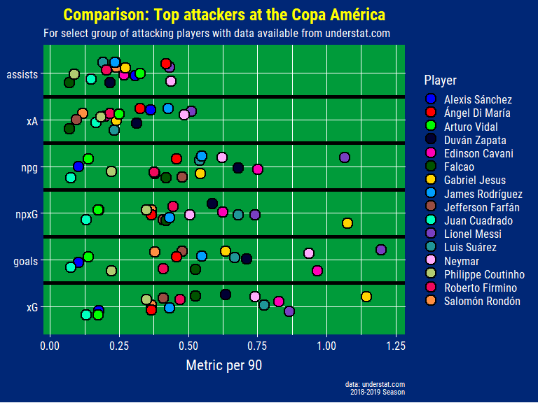
As usual in these types of charts, Messi is leading a lot of the metrics here and showing consistency too with having played the third highest amount of minutes out of the selected players. It’s helpful to have the xG/xA stats next to the actual goals/assists as it provides an indication of whether the player in question is scoring shots that he probabilistically should be scoring. When a player’s actual goal count is higher than their xG stat this suggests that the player is “exceeding their xG” or that they are scoring from shots that are historically hard to score from. It can be seen as a marker of an elite finisher as they are putting away chances from difficult situations consistently. In terms of assists and xA Alexis Sanchez, who only played about 600 minutes, looks a lot better than in reality due to the aforementioned disadvantage of standardizing everything to a “per 90 minutes” value. Normally you would have a cut-off based on a certain minimum amount of minutes but as I mentioned I was rather limited in my choice of players.
A way to take a closer look at xG - Goals and xA - Assists is to use a simple dot plot with a line going through the 45 degree angle. Those below the line are underperforming relative to their xG or xA stat, those over it are overachieving (“exceeding” their xG/xA stat) while those just on the line are scoring or assisting right around what the model expects the player to be. I use non-penalty xG below as penalties have around ~0.75 xG (give or take a few percentage points depending on the model) and can inflate the stats of those players who take a lot of penalties and score them, especially if they weren’t the ones who earned the penalty themselves.
expected_goal_plot <- understat_data %>%
  filter(year == 2018) %>%
  select(player_name, time, npxG, xG, goals) %>%
  mutate_at(c("npxG", "xG", "goals"), ~. / time * 90) %>%
  ggplot(aes(x = npxG, y = goals, fill = player_name)) +
  geom_abline(intercept = 0, slope = 1, color = "white", size = 1.1) +
  geom_point(shape = 21, size = 5, color = "black", stroke = 1.1) +
  scale_x_continuous(limits = c(0, 1.1),
                     expand = c(0, 0)) +
  scale_y_continuous(limits = c(0, 1.3),
                     expand = c(0, 0)) +
  scale_fill_manual(values = pals::glasbey(16), name = "Player") +
  labs(title = "Expected vs. Actual Goals",
       subtitle = "For select group of attacking players with data available from understat.com",
       x = "Non-penalty xG per 90 minutes",
       y = "Goals per 90 minutes",
       caption = glue::glue("
                            data: understat.com
                            2018-2019 Season")) +
  theme_copaAmerica(panel.grid.minor.x = element_line(color = "white"),
                    panel.grid.minor.y = element_line(color = "white"),
                    subtitle.size = 11)

expected_goal_plot
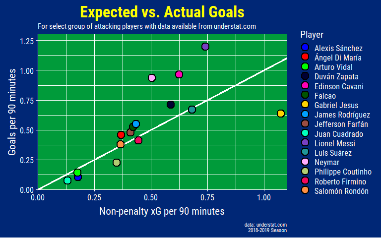
Gabriel Jesus is quite clearly below the 45 degree line meaning that he has been very poor at finishing chances (and/or incredibly unlucky). After a poor World Cup where he scored 0 goals as a starter, he is really going to have to step up to fill Neymar’s goalscoring boots for this tournament. However, his build-up play for City has still been good this past season and he has been scoring for Brazil in the friendlies leading up to the tournament so it’s going to be a hard decision for Tite to decide on who starts against Bolivia (edit: Firmino started and contributed an assist while Jesus replaced him in the 65th minute).
expected_assists_plot <- understat_data %>%
  filter(year == 2018) %>%
  select(player_name, time, xA, assists) %>%
  mutate_at(c("xA", "assists"), ~. / time * 90) %>%
  ggplot(aes(x = xA, y = assists, fill = player_name)) +
  geom_abline(intercept = 0, slope = 1, color = "white", size = 1.1) +
  geom_point(shape = 21, size = 5, color = "black", stroke = 1.1) +
  labs(title = "Expected vs. Actual Assists",
       subtitle = "For select group of attacking players with data available from understat.com",
       x = "xA per 90 minutes",
       y = "Assists per 90 minutes",
       caption = glue::glue("
                            data: understat.com
                            2018-2019 Season")) +
  scale_x_continuous(limits = c(0, 0.55),
                     expand = c(0, 0)) +
  scale_y_continuous(limits = c(0, 0.55),
                     expand = c(0, 0)) +
  scale_fill_manual(values = pals::glasbey(16), name = "Player") +
  theme_copaAmerica(panel.grid.minor.x = element_line(color = "white"),
                    panel.grid.minor.y = element_line(color = "white"),
                    subtitle.size = 11)

expected_assists_plot
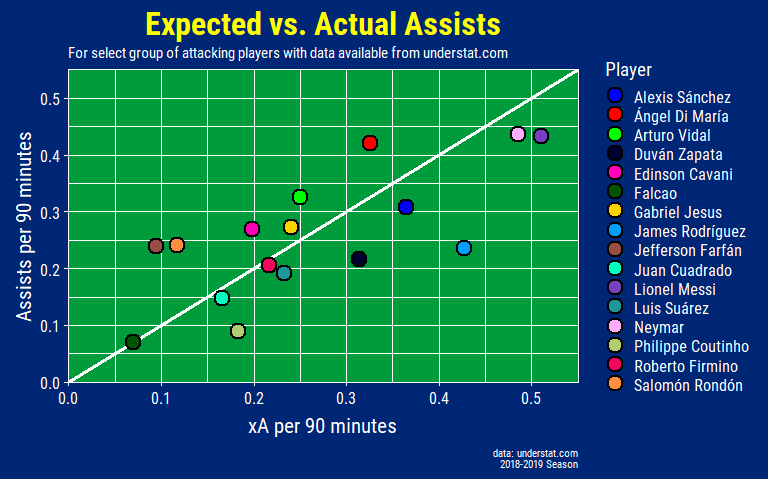
One thing to keep in mind is that xA does not take into account the recipient of the assist pass. Even if the pass given had a high expected assist value the receiving player still might not have the quality to put it away through no fault of the passer. This might explain why most of the players with a higher xA among this group don’t have the assists to match. It can also be that these players are also the ones playing a lot more minutes and the volume of chances they create just aren’t translating to goals all the time.
Key Passes, Shots, xGChain, and xGBuildup (per 90)
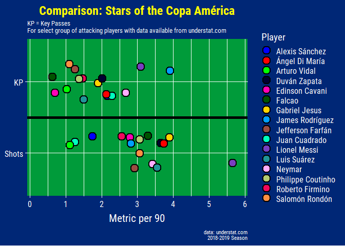
I separated “key passes” and “shots” as well as “xGChain” and “xGBuildup” from the rest as these two sets were on a very different scale.
kp_shots_plot <- comparison_data %>%
  filter(key == "Shots" | key == "KP") %>%
  mutate(value = value / time * 90) %>%
  ggplot(aes(x = key, y = value, fill = player_name)) +
  geom_jitter(shape = 21, size = 5, color = "black", width = 0.25, stroke = 1.1) +
  coord_flip() +
  scale_y_continuous(expand = c(0.01, 0.01),
                     limits = c(0, 6),
                     breaks = c(0, 1, 2, 3, 4, 5, 6),
                     labels = c(0, 1, 2, 3, 4, 5, 6)) +
  scale_fill_manual(values = pals::glasbey(17), name = "Player") +
  geom_vline(xintercept = 1.5, size = 2) +
  labs(title = "Comparison: Stars of the Copa América",
       subtitle = glue("
                       KP = Key Passes
                       For select group of attacking players with data available from understat.com"),
       x = NULL, y = "Metric per 90",
       caption = glue::glue("
                            data: understat.com
                            2018-2019 Season")) +
  theme_copaAmerica(title.size = 18,
                    subtitle.size = 10,
                    panel.grid.minor.x = element_line(color = "white"))

kp_shots_plot
-
xGChain: Quantitative measure that is the combined sum of the xG of every possession that ends in a shot that a player is involved in. The same derived value is given to each of the players involved and allows us to credit players for attacking contributions outside of just shots (xG) and assists (xA).
-
xGBuildup: Similar to xGChain but excluding shots and assists. This is in response to xGChain values still being dominated by the xG and xA from shots and assists, respectively.
xgbuildup_xgchain_plot <- comparison_data %>%
  filter(key == "xGBuildup" | key == "xGChain") %>%
  mutate(value = value / time * 90) %>%
  ggplot(aes(x = key, y = value, fill = player_name)) +
  geom_jitter(shape = 21, size = 5, color = "black", width = 0.25, stroke = 1.1) +
  coord_flip() +
  scale_y_continuous(expand = c(0.01, 0.01),
                     limits = c(0, 1.55),
                     breaks = c(0, 0.25, 0.5, 0.75, 1, 1.25, 1.5),
                     labels = c(0, 0.25, 0.5, 0.75, 1, 1.25, 1.5)) +
  scale_fill_manual(values = pals::glasbey(17), name = "Player") +
  geom_vline(xintercept = 1.5, size = 2) +
  labs(title = "Comparison: Stars of the Copa América",
       subtitle = "For select group of attacking players with data available from understat.com",
       x = NULL, y = "Metric per 90",
       caption = glue::glue("
                            data: understat.com
                            2018-2019 Season")) +
  theme_copaAmerica(title.size = 18,
                    subtitle.size = 10,
                    panel.grid.minor.x = element_line(color = "white"))

xgbuildup_xgchain_plot
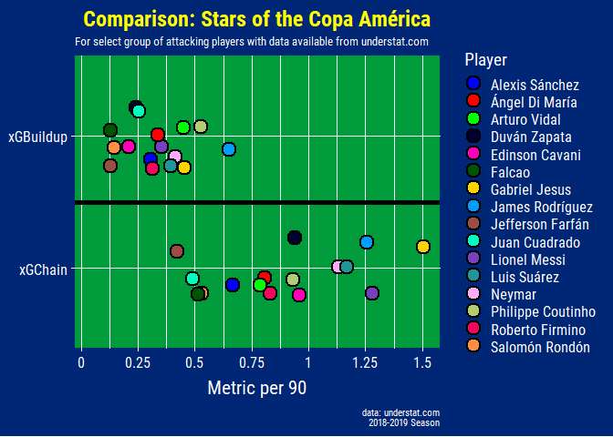
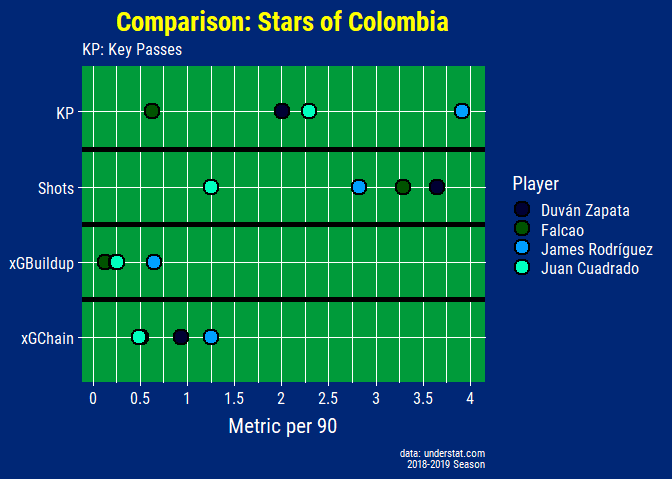
Although Gabriel Jesus has been poor at finishing his chances as seen in previous graphs, his xGChain and xGBuildup stat makes it clear that he is still contributing to City’s attack outside of scoring goals himself (not to mention all the defensive work he does as well).
For example below, the stats are able to clearly differentiate between James, who is more of a playmaker, compared to Falcao and Duvan who are traditional number 9s with his superior xGBuildup, xGChain, and Key Passes values. For a more detailed overview on xGChain and xGBuildup check out Statsbomb’s article here.
## keep colors for Colombians consistent with other plots
colombia_pal <- c("#000033", "#005300", "#009FFF", "#00FFBE")

comparison_colombia_plot <- comparison_data %>%
  filter(!key %in% c("xG", "goals", "npxG", "npg", "xA", "assists"),
         player_name %in% c("James Rodríguez", "Falcao", "Duván Zapata", "Juan Cuadrado")) %>%
  mutate(value = value / time * 90) %>%
  ggplot(aes(x = key, y = value, fill = player_name)) +
  geom_point(shape = 21, size = 5, color = "black", stroke = 1.1) +
  geom_vline(xintercept = 1.5, size = 2) +
  geom_vline(xintercept = 2.5, size = 2) +
  geom_vline(xintercept = 3.5, size = 2) +
  coord_flip() +
  scale_y_continuous(expand = c(0.05, 0.05),
                     breaks = c(0, 0.5, 1, 1.5, 2, 2.5, 3, 3.5, 4),
                     labels = c(0, 0.5, 1, 1.5, 2, 2.5, 3, 3.5, 4)) +
  scale_fill_manual(values = colombia_pal, name = "Player") +
  labs(title = "Comparison: Stars of Colombia",
       subtitle = "KP: Key Passes",
       x = NULL, y = "Metric per 90",
       caption = glue::glue("
                            data: understat.com
                            2018-2019 Season")) +
  theme_copaAmerica(title.size = 20,
                    subtitle.size = 12,
                    panel.grid.minor.x = element_line(color = "white"))

comparison_colombia_plot
There are lots of different ways to visualize this data, most famously
the radar charts created by Statsbomb. Using
the data you can also compare and evaluate players in many different
ways and using understatr package you could add a few more players
like Paulo Dybala, Miguel Almiron, and more! I could probably do a whole
other article using just this data but I’ll leave it here for now.
Conclusion
Throughout this blog post I talked about some of the historical records, squad compositions, match records, and finally the player profiles of attacking players at this summer’s Copa América. Using the power of R it is really easy to webscrape and visualize data in a way that is informative and aesthetically pleasing. I wanted to finish this before the tournament started but other life things got in the way as well as the fact that the amount of content ballooned out of control (especially the xG section) so I had to cut down a lot.
It’s been fun reading the articles on the Copa América website and seeing how far my “intermediate-but-very-out-of-practice”-level of Spanish can get me to understand the content, here is one that I particularly liked reading: 14 Estadisticas de la Copa América. With so many tournaments going on right now (and with the African Cup of Nations starting in a few days) a lot of the news media is spread thin right now but there are still some quality articles out there to read about the Copa, like this article from BBC’s South American football expert, Tim Vickery.
After the first round of games, a few points of discussion:
-
After an extremely lacklustre performance vs. Colombia, how does Argentina bounce back? What tactical changes need to be made?
-
Qatar impressed against Paraguay but can they pull off a major upset vs. Colombia?
-
How will Japan line-up against Uruguay after a losing by a scoreline that didn’t really do their performance justice? How will manager Moriyasu balance experience vs. youth, will he start with veteran Okazaki after Ueda’s numerous misses vs. Chile? How will Japan deal with their glaring weaknesses at the fullback position? Will Yuta Nakayama keep his place after an awful performance?
-
Can Brazil earn a early ticket to the next round vs. Venezuela after a clinical but not excellent performance vs. Bolivia? Will they be able to keep up their streak of winning the Copa every time they have hosted it?
Thanks for reading and…
¡Buena suerte a todos equipos!