In this blog post I weave in gganimate, tweenr, and highcharter plots while exploring the American policies that aided Japan’s postwar economic miracle! Back in college, I wrote a paper on this subject for my United States Economic History class. We were supposed to include a few tables and graphs in our paper and, as this was a year before I learned about R, everything was done in Excel. More than a year ago, I went back and recreated the graphs using ggplot2 for some easy practice and now I’m going another level higher by implementing gganimate, tweenr, and highcharter into my plots!
There won’t be a lot of code as other posts as I didn’t have to do much data munging for this mini-project. I tried to summarize/shorten the gist of my paper but even then, if you don’t like history and just want to see how to do animated/interactive graphs, go ahead but you’ll be missing a lot of the context! I’ve included references and also a Further Reading section at the end as my original (undergraduate) paper is by no means a comprehensive survey of the economic and political events in the postwar period (especially as my focus was on the American policies).
Postwar Japan and the Korean War
Under American occupation, Japan was barely surviving on subsidies and US aid as the Supreme Commander of the Allied Powers (SCAP) restricted Japan’s foreign trade and international transactions. The main goal, initially, was to cripple the Japanese economy (especially in terms of its heavy industries) so that it could never produce military goods again (Ohno, 2005). Some of the reforms initiated by SCAP include the breaking up of the zaibatsu (family-owned mega-conglomerates that had a large role in Japanese war industries), new labor laws, land reform, and the well-known political reforms (the renunciation of the Emperor as a God and Article 9 in the new constitution, which renounced war).
In 1948, President Truman asked Joseph Dodge for help in reconstructing Japan’s economy (due to his successes in rebuilding Germany) midst the looming threat of Communism in Asia with Mao’s forces inching closer to total victory over the Kuomintang (Nakamura & Odaka, 2003). Introducing austerity measures and setting an advantageous exchange rate for Japan among other policies which helped combat inflation, Dodge nevertheless caused severe adverse economic shocks and economic output tanked (Ohno, 2005). Fortunately, Japan’s saving grace came with the start of the Korean War in 1950.
With high external demand leading to an export boom, Japan’s recession ended quickly and the economy boomed as industrial output increased by more than 50% between 1950 and 1951, export values increased by 53%, and the total value of foreign trade increased by 84% (Dingman, 1993). This huge influx of dollars provided the investment needed for many different sectors of the Japanese economy to modernize their means of production (Dingman, 1993).
Shifts in American policy regarding the Japanese economy
From around 1947 there was a profound shift away from the initial American policies aimed at limiting Japanese heavy industry. While diplomats such as William R. Castle emphasized the rhetoric that Japan can serve as a capitalist bulwark against Soviet expansion into Asia, American policy makers preoccupied with postwar economic issues saw Japanese economic recovery as a solution to domestic problems (Schonberger, 1982). Gradually, politicians such as George Kennan (Policy Planning Staff in the State Department) and William Draper (Army Undersecretary) moved to dilute the impact of SCAP policies such as the zaibatsu dissolution reform “FEC-230” (Schonberger, 1982). Their revision, modeled after the Marshall Plan, argued that a two year burst of aid appropriations would increase Japanese exports and thereby foreign exchange for imports of basic necessities and allow for the United States to stop sending aid by 1953 (Schonberger, 1982).
SCAP and MacArthur refused to cooperate as they believed the zaibatsu were militarists and a fundamental change of the Japanese economic system was needed. However, in the summer of 1948, MacArthur acquiesced and the reform only broke up 19 of the 324 planned firms while banks were exempted altogether (Schonberger, 1982). Other factors tied into this such as the traditionally strong Japanese legal support for zaibatsu and the lobbying to Congress by American corporations with ties to these Japanese companies. As a result most zaibatsu were modified into keiretsu (bank-centered, industrial conglomerates) and American foreign grants/credits to Japan declined sharply by 1953 (Statistical Abstract of the United States 1954, pp. 902; Statistical Abstract of the United States 1960, pp. 906).
The Steel Industry
The steel and coal industry was one of the first industries targeted to revitalize the economy as both the Japanese government and SCAP recognized them as a valuable input for other industries (Elbaum, 2007; Fletcher, 2006). Coal was Japan’s only domestically available resource and it was believed that increased coal output would lead to increased steel manufacturing, leading to increased allocation of steel for coal production, presenting a positive feedback loop for the economy. With the profits from the Korean War through US military procurement reinvested throughout the ’50s, the steel industry contributed heavily to overall productivity gain and steel production rose up and above pre-war levels (Ohno, 2006).
library(dplyr)    # pipes and dplyr verbs
library(readr)    # reading in .csv files

library(ggplot2)  # plotting
library(ggthemes) # ggplot2 themes
library(scales)   # ggplot2 scaling options


Japan_Steel <- readxl::read_xls("Data/iron_steel_production_1948-2004.xls",
                             skip = 7,
                             col_names = c("J_Year", "Year", "Pig_iron",
                                           "Ferro-alloys", "Crude_steel",
                                           "Hot_steel_products", "Galvanized_sheets")) %>%
  select(Year, Crude_steel) %>%
  filter(Year <= 1960)
(NOTE: I originally used data from Statistical Abstract of the United States (editions between 1950 and 1960), in process of writing this article I tried to find more data from before 1950 and came across the Historical Statistics of Japan (by the Japan Statistical Association) that has the crude steel production from 1948 to 2004. Although the Statistical Abstract data matched up well with the Japanese source I elected to recreate this graph from the Historical Statistics of Japan data instead.)
Introducing gganimate!
The idea behind gganimate is simple, as the name implies the animation part of a plot becomes just another aesthetic within the ggplot concept. This package is dependent on ImageMagick and FFmpeg to save your plots as GIFs or videos so make sure you have those installed as well. Once all that’s done, go into the ggplot() code you previously made and it’s just as simple as adding in frame = ____ (whatever the variable you want to create an individual frame out of). You can also include cumulative = TRUE if you want to keep previous frames of added data on the plot as you change to the next frames.
For other tutorials take a look at gganimate’s Github repo for a short tutorial or take a look at Peter Aldhous’ lecture notes on Iteration & Animation (with ggplot2).
If you’re more of a video person or just want something to watch while grabbing some lunch here is David Robinson talking about gganimate at Plotcon 2016 (~33 minutes long).
library(gganimate) # animations

Steel_Animate <- Japan_Steel %>%
  ggplot(aes(x = Year, y = Crude_steel, frame = Year, cumulative = TRUE)) +
  geom_line(size = 2.5, color = "#474747") +
  scale_x_continuous(breaks = pretty_breaks(n = 10)) +
  scale_y_continuous(breaks = pretty_breaks(), labels = comma, limits = c(0, 26000)) +
  geom_vline(xintercept = 1950) +
  geom_vline(xintercept = 1953) +
  annotate(geom = "text",
           label = "Korean\nWar", size = 5, color = "#474747",
           x = 1951.55, y = 17500) +
  theme_economist_white() +
  theme(axis.text = element_text(size = 10, color = "#474747"),
        axis.title = element_text(size = 15, color = "#474747"),
        plot.title = element_text(hjust = 0.5, color = "#474747")) +
  labs(x = "Year", y = "Steel Production (Thousands of tons)",
       title = "Japan Steel Production\nYear:",
       caption = "Source: Historical Statistics of Japan, 2012")

gganimate(Steel_Animate, ani.width = 800, ani.height = 500, "Steel_Animate.gif")
## Output at: Steel_Animate.gif
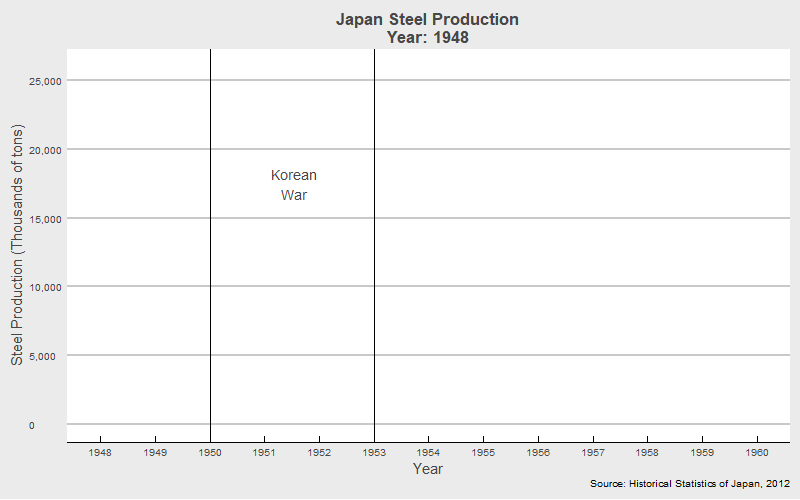
Looks great! However, the animation looks a bit jagged, but we’ll look at ways to fix that in the next section!
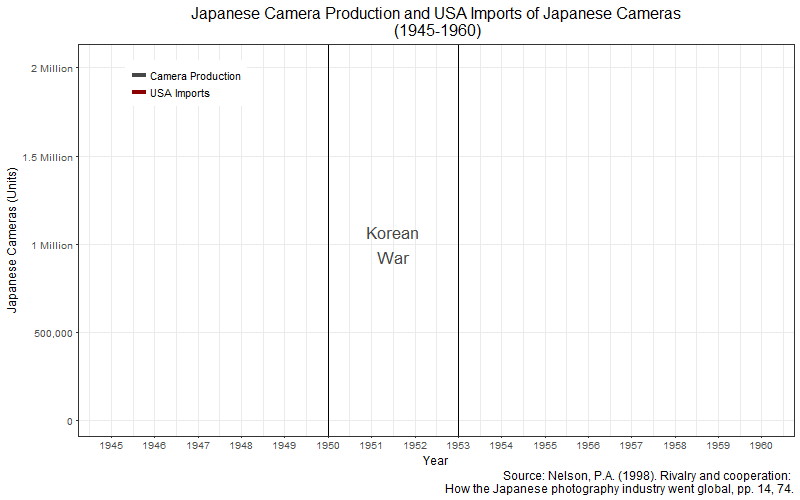
The Camera Industry
The camera industry had a quick recovery as the camera companies were one of the earliest to receive permits to resume production by SCAP in early 1946 and Japan already had all the raw materials needed for production (Nelson, 1998). The American military post exchanges (PX) throughout the Korean and Vietnam Wars allowed for large influx in dollars for Japan through camera and lens sales due to demand from American soldiers and also allowed Japanese camera products (most notably those from familiar companies such as Nikon and Canon) to enter the American market through its popularity among the returning American personnel (Nelson, 1998). By the 1970s, when American policies shifted regarding Japan’s favorable exchange rate, it did not matter as Japan no longer needed to rely solely on the US market as it had in its postwar infancy (Nelson, 1998).
Introducing tweenR!
To create smoother animations between data points we can use tweenr, a package created by Thomas Pedersen which allows you to interpolate your data between different states. Although like in this example, it is highly complementary with gganimate, it can be used in many other cases as well! Some examples can be found on Len Kiefer’s excellent blog here. To show you how interpolation works, I manually created a small example. Let’s say you have a data set like this:
tribble(
  ~year, ~num,
  1950, 56,
  1951, 59,
  1952, 64,
  1953, 67,
  1954, 69,
  1955, 74,
  1956, 78,
  1957, 83
)
So in a time series plot, as in the steel production plot, it will transition a bit awkwardly from point to point. This is where interpolation can help! By creating a lot of smaller data points in between the main data points you can create something like this:
tribble(
  ~year, ~num,
  1950.0, 56.0,
  1950.1, 56.3,
  1950.2, 56.6,
  1950.3, 56.9,
  1950.4, 57.2,
  1950.5, 57.5,
  1950.6, 57.8,
  1950.7, 58.1,
  1950.8, 58.4,
  1950.9, 58.7,
  1951.0, 59.0   # etc.
)
(only showing between 1950 and 1951 to save space…) Therefore, making the transitions in a time series animation appear “smoother”!
I was having a bit of trouble creating the list of data frames necessary to provide as the input for the tween_states() function. I asked for help on R Studio Community and user alistaire replied with a great answer here. Below, I’ll go through what he did step-by-step.
First, we use map() to create a list of data frames containing the data for each row in Japan_Camera (16) with the same number of observations in Japan_Camera. However, the observations in each data frame (for the individual rows) that have not been displayed yet are replaced with the values for the previously displayed row.
As a result we have a list of 16 data frames (view shortened to the first 3 to save space). Look carefully at the slight changes in the Camera_Production column if you didn’t understand the above explanation.
library(purrr)

Japan_Camera <- read_csv("Data/JapanCamera&USAImportCamera(1945-1960).csv",
                         col_names = c("Year", "Camera_Production", "USA_Imports"),
                         skip = 1)

Camera_List <- map(seq(nrow(Japan_Camera)),
                   ~Japan_Camera[c(seq(.x), rep(.x, nrow(Japan_Camera) - .x)), ])

str(Camera_List, list.len = 4)
## List of 16
##  $ :Classes 'tbl_df', 'tbl' and 'data.frame':    16 obs. of  3 variables:
##   ..$ Year             : int [1:16] 1945 1945 1945 1945 1945 1945 1945 1945 1945 1945 ...
##   ..$ Camera_Production: int [1:16] 13082 13082 13082 13082 13082 13082 13082 13082 13082 13082 ...
##   ..$ USA_Imports      : int [1:16] NA NA NA NA NA NA NA NA NA NA ...
##  $ :Classes 'tbl_df', 'tbl' and 'data.frame':    16 obs. of  3 variables:
##   ..$ Year             : int [1:16] 1945 1946 1946 1946 1946 1946 1946 1946 1946 1946 ...
##   ..$ Camera_Production: int [1:16] 13082 24145 24145 24145 24145 24145 24145 24145 24145 24145 ...
##   ..$ USA_Imports      : int [1:16] NA NA NA NA NA NA NA NA NA NA ...
##  $ :Classes 'tbl_df', 'tbl' and 'data.frame':    16 obs. of  3 variables:
##   ..$ Year             : int [1:16] 1945 1946 1947 1947 1947 1947 1947 1947 1947 1947 ...
##   ..$ Camera_Production: int [1:16] 13082 24145 51772 51772 51772 51772 51772 51772 51772 51772 ...
##   ..$ USA_Imports      : int [1:16] NA NA NA NA NA NA NA NA NA NA ...
##  $ :Classes 'tbl_df', 'tbl' and 'data.frame':    16 obs. of  3 variables:
##   ..$ Year             : int [1:16] 1945 1946 1947 1948 1948 1948 1948 1948 1948 1948 ...
##   ..$ Camera_Production: int [1:16] 13082 24145 51772 53016 53016 53016 53016 53016 53016 53016 ...
##   ..$ USA_Imports      : int [1:16] NA NA NA NA NA NA NA NA NA NA ...
##   [list output truncated]
Now that we have the list of data frames ready we can use the tween_states() function to specify how the transitions between the “states” of our data are created. Each “state” will be the individual data frames that we just created. Within the function, tweenlength is length of the transitions between state to state, statelength is the pause at each state, ease is the function used for the transitions, and nframes is the number of frames to generate for the animation.
library(tweenr)

Camera_Tween <- Camera_List %>%
    tween_states(tweenlength = 3, statelength = 2, ease = 'linear', nframes = 200)

glimpse(Camera_Tween)
## Observations: 3,456
## Variables: 4
## $ Year              <dbl> 1945, 1945, 1945, 1945, 1945, 1945, 1945, 19...
## $ Camera_Production <dbl> 13082, 13082, 13082, 13082, 13082, 13082, 13...
## $ USA_Imports       <dbl> NA, NA, NA, NA, NA, NA, NA, NA, NA, NA, NA, ...
## $ .frame            <int> 1, 1, 1, 1, 1, 1, 1, 1, 1, 1, 1, 1, 1, 1, 1,...
Now from the original 16 rows/observations we now have 1712 rows due to creating the interpolating frames! The tween_states() function has added a .frame variable that corresponds with the expanded data.
After saving everything as a ggplot object, we can specify a variety of animation options inside gganimate(), here we speed up the time interval between frames with interval = 0.05. We also set the dimensions for the plot, save it as a GIF, and Voilá!
Camera_Animate <- Camera_Tween %>%
    ggplot(aes(x = Year, y = Camera_Production, frame = .frame)) +
    geom_path(aes(y = Camera_Production,
                  color = "Camera Production", frame = .frame), size = 1.5) +
    geom_path(aes(y = USA_Imports,
                  color = "USA Imports", frame = .frame), size = 1.5) +
    scale_x_continuous(breaks = pretty_breaks(n = 20)) +
    scale_y_continuous(labels = c("0", "500,000", "1 Million", "1.5 Million", "2 Million")) +
    scale_color_manual(values = c("Camera Production" = "#474747",
                                  "USA Imports" = "darkred")) +
    geom_vline(xintercept = 1950) +
    geom_vline(xintercept = 1953) +
    annotate(geom = "text",
             label = "Korean\nWar", size = 6, color = "#474747",
             x = 1951.5, y = 1000000) +
    theme_bw() +
    theme(axis.title = element_text(size = 12),
          axis.text = element_text(size = 10),
          title = element_text(size = 13.5),
          plot.title = element_text(hjust = 0.5),
          legend.position = c(0.15, 0.9),
          legend.title = element_blank(),
          legend.text = element_text(size = 10.5),
          panel.grid.minor.y = element_blank()) +
    labs(x = "Year", y = "Japanese Cameras (Units)",
         title = "Japanese Camera Production and USA Imports of Japanese Cameras\n (1945-1960)",
         caption = "Source: Nelson, P.A. (1998). Rivalry and cooperation: \nHow the Japanese photography industry went global, pp. 14, 74.")

# animation::ani.options(interval = 0.05)

gganimate(Camera_Animate, ani.width = 800, ani.height = 500, title_frame = FALSE, interval = 0.05, "Camera_Animate.gif")
## Output at: Camera_Animate.gif
The Cotton Textiles Industry
As a result of the loss of its overseas territories, Japan lost 2.75 million cotton spindles from China and Manchuria with a further 210,000 in Korea (Fletcher, 2006). With the United States’ help, however, the cotton textiles industry became the leading export industry from 1946-1960 (taking up around 59% of the dollar value of all Japanese exports) which allowed for raw material and food imports into a war-devastated Japan (Fletcher, 2006; Sugihara, 1999). The United States pursued this initiative due to the accumulation of raw cotton by the Commodity Credit Corporations from various New Deal policies; exporting this raw cotton to Japan would increase government revenue and raise cotton prices for the benefit of American producers (Fletcher, 2006; Abe, 2005). The American government also believed that this course of action would help relieve American taxpayers the burden of paying aid/subsidies for Japanese imports of basic necessities by allowing Japan to sustain itself through its textile exports as well as reinvest the dollars earned into other recovering industries (Abe, 2005; Fletcher, 2006).
As a result, by 1951, Japan had become the largest exporter of cotton textiles in the world with a large percentage of the approximately 2.9 billion square yards produced each year (1955-1970) going to the United States (Abe, 2005). As the domestic American textile market applied pressure to install export quotas, the share of Japanese textile exports fell from 72% in 1957 to a mere 20% in 1960. However, the entry of other Asian countries into the American market made these quotas against Japanese exports meaningless and the Japanese economy began to focus on other industries from the 1960s onward, most famously, the automobile industry.
Introducing highcharter!
The highcharter package by Joshua Kunst allows you to access the Highcharts JavaScript visualization library and can seamlessly fit into your R workflow as it uses %>% to connect functions. For some examples check this link out. To find out more about the myriad of options available to build your chart, check out the Highcharts API reference here. For the more advanced customizations you might need to know JS and/or HTML but Stack Overflow posts can help you out (tags: highcharts & r-highcharter)! Another great tutorial to learn Highcharter from is here, another page out of Peter Aldhous’ lecture notes!
What I did here was to show across 2 different y-axes, the total amount of Japanese textile exports and the percentage of those exports heading to the USA. Instead of having them on one graph, I moved the axes labels to opposite sides and had each time series split up the y-axis space between them using the hc_yAxis_multiples() function. To make things easier to understand, I had the tooltip show the data for both time series using hc_tooltip() and customizing the labels for each series inside the tooltip with the tooltip = argument inside their respective hc_add_series() function. You can even export what you’ve made as a standalone web page using the saveWidget() function from the htmlwidgets package!
Japan_Textiles <- read_csv("Data/JapanCottonTextileExports(1946-1960).csv",
                           col_names = c("Year", "total_exports", "exports_to_USA",
                                         "percentage_exports_USA"),
                           skip = 1)

library(htmlwidgets)
library(highcharter)

colors <- RColorBrewer::brewer.pal(2, "Set1")

textiles_chart <- highchart() %>%
   hc_colors(colors) %>%
   hc_yAxis_multiples(
     list(top = "0%", height = "30%", lineWidth = 3, opposite = TRUE,
          title = list(text = "% of Total Exports")),
     list(top = "30%", height = "70%",
          title = list(text = "Total Exports (Millions sq. yards)"))
   ) %>%
   hc_xAxis(title = list(text = "Year"),
            categories = Japan_Textiles$Year,
            tickInterval = 1) %>%
   hc_add_series(name = "Total Exports",
                 data = Japan_Textiles, hcaes(Year, total_exports),
                 type = "spline", yAxis = 1,
                 tooltip = list(valueSuffix = " M.Sq.Yards")) %>%
   hc_add_series(name = "Percentage (%) of Exports to USA",
                 data = Japan_Textiles, hcaes(Year, percentage_exports_USA),
                 type = "spline", yAxis = 0,
                 tooltip = list(valueSuffix = "%", valueDecimals = "1")) %>%
   hc_tooltip(shared = TRUE,
              borderColor = "black",
              headerFormat = '<span style = "font-size: 14px"><b>{point.key}</b></span><br/>'
              ) %>%
   hc_title(text = "Japan's Exports of Cotton Textiles (1946-1960)")

saveWidget(textiles_chart, "textiles_chart.html", selfcontained = TRUE, background = "white")
(Source: Sugihara, K. (1999). International circumstances surrrounding the postwar Japanese cotton textile industry, pp. 15-16.)
Conclusion
Despite the devastation of the Allied bombing campaigns and the initial SCAP policies, the growing tensions of the Cold War and the postwar needs of America became the catalyst for a dramatic heel-turn in economic policy that laid the foundations for a miraculous Japanese recovery. By studying the causes and impacts of external/internal events and policies we can gain clues to tackle the future challenges in rebuilding economies in other war-devastated areas of the world.
To finish off this blog post, just a few thoughts… Doing this mini-project, it was quite nice to go back through some old research and look for more/better data sources as the volume of data available is always growing, with older research being digitized daily. Back when I was first doing this research paper, even with PDF versions available, I would usually grab a few actual copies of The Statistical Abstract of the United States from the shelves and flip through them… they really gave me a sense of wonder and I kind of felt the “weight” of history through those hefty volumes which is something that can’t really be “felt” from digital sources. Finally, when I started writing this post, I didn’t think it would get as long as it ended up, but with it came a better understanding of plotting in R which I hope can be of help to anybody else looking for visuaz real-world examples!
References:
-
Abe, T. (2005). The restructuring of cotton spinning companies in postwar Japan. (Discussion paper). Graduate School of Economics and Osaka School of International Public Policy.
-
Castle, A.L. (1990). William R. Castle and the postwar transformation of Japan, 1945-1955. The Wisconsin Magazine of History, 74, 125-137.
-
Dingman, R. (1993). The dagger and the gift: The impact of the Korean War on Japan. Journal of American-East Asian Relations, 2, 29-55.
-
Elbaum, B. (2007). How Godzilla ate Pittsburgh: The long rise of the Japanese iron and steel industry, 1900-1973. Social Science Japan Journal, 10, 243-264.
-
Fletcher, W.M. (2006). A miracle of sorts: The Japan Spinners Association and the recovery of the cotton textile industry, 1945-1952. UNC-Chapel Hill.
-
Kingston, J. (2010). Japan in transformation, 1945-2010. London: Routledge.
-
Miller, J.M. (2011). The struggle to rearm Japan: Negotiating the Cold War state in US-Japanese relations. Journal of Contemporary History, 46, 82-108.
-
Nakamura, T. & Odaka, K. (2003). The economic history of Japan: 1600-1900. (Vol. 3). (Noah S. Brannen, Trans.) Oxford University: Oxford University Press.
-
Nelson, P.A. (1998). Rivalry and cooperation: How the Japanese photography industry went global. (Unpublished doctoral dissertation). University of Warwick, UK.
-
Ohno, K. (2006). The economic development of Japan. Tokyo, Japan: GRIPS Development Forum
-
Schonberger, H. (1982). U.S. policy in post-war Japan: The retreat for liberalism. Science & Society, 46, 39-59.
-
Sugihara, K. (1999). International circumstances surrounding the postwar Japanese cotton textile industry. (Discussion paper). Graduate School of Economics and Osaka School of International Public Policy.
-
U.S. Census Bureau. (1955). Statistical Abstract of the United States: 1954. Washington, DC: U.S. Government Printing Office.
-
… Statistical Abstract of the United States, 1955 to 1962 …
Further Reading:
-
Beason, R., & Weinstein, D. (1996). Growth, Economies of Scale, and Targeting in Japan (1955-1990). The Review of Economics and Statistics, 78(2), 286-295.
-
Blumenthal, T. (1972). Exports and Economic Growth: The Case of Postwar Japan. The Quarterly Journal of Economics, 86(4), 617-631.
-
Esteban-Pretel, J., & Sawada, Y. (2014). On the role of policy interventions in structural change and economic development: The case of postwar Japan. Journal of Economic Dynamics and Control, 40, 67-83.
-
Johnson, C. (1982). MITI and the Japanese miracle: the growth of industrial policy: 1925-1975. Stanford University Press.
-
Jorgenson, D. W., & Nishimizu, M. (1978). US and Japanese economic growth, 1952-1974: an international comparison. The Economic Journal, 88(352), 707-726.
-
Ozawa, T. (1974). Japan’s technological challenge to the West, 1950-1974: Motivation and accomplishment. MIT Press Books, 1.