“Hey there criminal. It’s me, Johnny Law!” - Jake Peralta, NYPD.
Brooklyn Nine-Nine has become one of my favorite sitcoms in recent
years, probably taking over from Parks & Recreation and Community. So in
this blog post, I’m going to web scrape some very simple TV statistics,
clean it up with the tidyverse, and visualize it with ggplot2…
“Terry loves ggplot2!”
Let’s get started!
Packages
pacman::p_load(tidyverse, rvest, glue, cowplot, ggbeeswarm,
               polite, extrafont, knitr, kableExtra)
loadfonts()
B99 Custom Theme
First, I created a custom Brooklyn Nine-Nine theme that I can put
on every plot. This will save me time from typing in
the same options over and over again! I googled the font type that the
official Brooklyn Nine-Nine media uses, downloaded them, and got it
installed for R using the extrafont package (EDIT: the Univers fonts are by Adrian Frutiger (Deberny & Peignot Foundry/Linotype). You can buy the fonts for around $30. A free and most similar alternative is Helvetica). For some of the different
colors you’ll see in the plots I sourced them from pasting in the
Brooklyn Nine-Nine logo and other official media images into
imagecolorpicker.com and saving the
hex codes that it gave me. Otherwise, I experimented with different
palettes from perusing Emil
Hvitfeld’s awesome
r-color-palettes
Github repository (Also special thanks to David
Smale for giving me some advice on
using color!).
theme_b99 <- function(){

  base_size <- 11
  half_line <- base_size / 2

  theme_minimal() %+replace%
    theme(text = element_text(family = "Univers", color = "#F9FEFF",
                              face = "plain", size = 14,
                              hjust = 0.5, vjust = 0.5, angle = 0,
                              lineheight = 0.9,
                              margin = margin(half_line, half_line,
                                              half_line, half_line),
                              debug = FALSE),
          plot.title = element_text(family = "Univers LT 93 ExtraBlackEx",
                                    size = 20, color = "#F9FEFF"),
          plot.background = element_rect(color = NA, fill = "#0053CD"),
          panel.background = element_rect(color = NA, fill = "#0053CD"),
          # axis options
          axis.text = element_text(family = "Univers", color = "#F9FEFF", size = 12),
          axis.title = element_text(size = 14),
          # legend options (for ratings plot)
          legend.title = element_text(family = "Univers", color = "#F9FEFF"),
          legend.text = element_text(family = "Univers", color = "#F9FEFF",
                                     size = 9),
          legend.position = "bottom",
          legend.key = element_rect(colour = "black", linetype = "solid", size = 1.5),
          legend.background = element_rect(color = "black", fill = "#0053CD",
                                           linetype = "solid"))
}
Now the plots will all look very similar, just like a good police squad:

With that done, I can start making plots!
Episode Ratings
ep_rating_df <- readr::read_csv("https://raw.githubusercontent.com/Ryo-N7/brooklyn_NINE_NINE_viz/master/data/data2/ep_rating_df.csv")

glimpse(ep_rating_df)
## Observations: 112
## Variables: 4
## $ title  <chr> "Pilot", "The Tagger", "The Slump", "M.E. Time", "The V...
## $ rating <dbl> 7.9, 7.7, 7.7, 7.8, 8.1, 8.5, 8.2, 7.9, 7.8, 8.3, 8.3, ...
## $ season <dbl> 1, 1, 1, 1, 1, 1, 1, 1, 1, 1, 1, 1, 1, 1, 1, 1, 1, 1, 1...
## $ ep_num <int> 1, 2, 3, 4, 5, 6, 7, 8, 9, 10, 11, 12, 13, 14, 15, 16, ...
OK, looks good.
Episode Ratings Plot: Heatmap and Boxplot
I used geom_tile() to create a heat map of episode ratings with the
season number as the rows and the episode number for that season as the
columns. I also used the dichromat package for the color scheme
“LightBluetoDarkBlue.10”, it meshes pretty well with the Brooklyn Nine-Nine
color theme!
rating_plot <- ep_rating_df %>%
  ggplot(aes(x = ep_num, y = season)) +
  geom_tile(aes(fill = rating), size = 1.5,
            color = "black") +
  scale_fill_gradientn("Rating", colors = dichromat::colorschemes$LightBluetoDarkBlue.10,
                       breaks = c(7.7, 8, 8.5, 9, 9.5)) +
  guides(fill = guide_colourbar(frame.colour = "black",
                                barwidth = unit(2, "in"))) +
  scale_x_continuous(expand = c(0.01, 0.01),
                     breaks = c(1, seq(from = 5, to = 20, by = 5), 23),
                     labels = c(1, seq(from = 5, to = 20, by = 5), 23)) +
  scale_y_reverse(expand = c(0.01, 0.01),
                  breaks = c(1:7),
                  labels = c(1:7)) +
  labs(x = "Episode Number", y = "Season",
       title = "Episode Ratings") +
  theme_b99() +
  theme(panel.grid = element_blank())

rating_plot
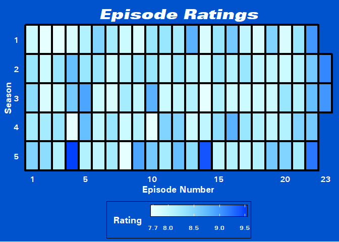
From what we can see on the graph there doesn’t seem to be any trends along either axis besides the fact that the finales and the subsequent opening episode of the following season are generally well-received. Two stand out episodes from Season 5 can be clearly seen in the plot. These episodes are “HalloVeen” (the fifth Halloween episode of the series) and “The Box” (an excellent episode featuring Sterling K. Brown as the perp).
Box Plot
Another way to visualize this would be with the box plot. This way allows you to make a comparison between seasons, whereas the heat map could be used to pick out any trends over time or sequence.
The debate between violin plot vs. box plot vs. sina plot vs. etc. rages on to this day (some examples I’ve read over the years: 1, 2, 3) and at the end of the day, it may come down to personal preference. Since the data I’m using is quite small (~20 episode ratings for each season), in my case it might be better to use box plots (instead of violin plots) and sprinkle bee swarm points on top with the ggbeeswarm package. I commented out some of the other methods if you wanted to copy-paste this code chunk into your R console to try them out!
I highlighted the outliers for each season in red with the unintentional result being that the color scheme mimics that of the flag of Colorado…
cols <- c("1" = "#6CA9C3", "2" = "#3A3533",
          "3" = "#000E33", "4" = "#CBCFD2", "5" = "#175E78")

box_plot <- ep_rating_df %>%
  ggplot(aes(x = season, y = rating, group = season)) +
  #geom_violin(color = "#F9FEFF", fill = "#000E33") +
  #ggthemes::geom_tufteboxplot(color = "#F9FEFF", fill = "#000E33") +
  #ggforce::geom_sina(color = "#F9FEFF", fill = "#000E33") +
  geom_boxplot(color = "#F9FEFF", fill = "#000E33",
              outlier.color = "red", outlier.size = 5) +
  geom_beeswarm(color = "#FCF40E", cex = 2, size = 2.25) +
  scale_y_continuous(limits = c(7.5, 9.6),
                     labels = c(7.5, 8, 8.5, 9, 9.5)) +
  labs(title = "Episode Ratings by Season",
       x = "Season", y = "Rating") +
  theme_b99() +
  theme(panel.grid.minor = element_blank())

box_plot
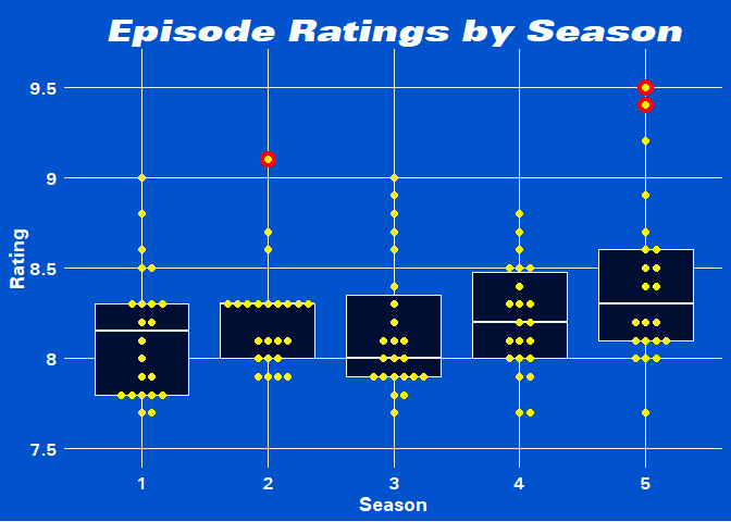
Noice, Smort! We get the best of both worlds by combining two different types of visualizing distributions. Let’s check out which episodes those red dots are…
ep_rating_df %>%
  group_by(season) %>%
  mutate(n = n(),
         third_quantile = quantile(rating)[4]) %>%
  filter(rating > third_quantile + 1.58 * (IQR(rating))) %>%
  select(-n, -third_quantile)
## # A tibble: 3 x 4
## # Groups:   season [2]
##   title           rating season ep_num
##   <chr>            <dbl>  <dbl>  <int>
## 1 Johnny and Dora    9.1      2     23
## 2 HalloVeen          9.5      5      4
## 3 The Box            9.4      5     14
Besides the (re)appearances of Doug Judy, Brooklyn Nine-Nine is known
for its Halloween Episodes. I wanted to use gt somewhere in this blog
post but that’s little bit overkill so a kable table will suffice for
now.
ep_rating_df %>%
  group_by(season) %>%
  top_n(n = 5, wt = rating) %>%
  arrange(desc(rating)) %>%
  mutate(rank = row_number()) %>%
  arrange(season, desc(rating)) %>%
  filter(str_detect(title, "Hallo")) %>%
  rename(Title = title, Rating = rating, Season = season,
         `Episode Number` = ep_num, Rank = rank) %>%
  kable(format = "html",
        caption = "The Halloween Episodes and Rank in Season") %>%
  kable_styling(full_width = FALSE)
| Title | Rating | Season | Episode Number | Rank |
|---|---|---|---|---|
| Halloween | 8.5 | 1 | 6 | 4 |
| Halloween II | 8.7 | 2 | 4 | 2 |
| Halloween III | 8.9 | 3 | 5 | 2 |
| Halloween IV | 8.7 | 4 | 5 | 2 |
| HalloVeen | 9.5 | 5 | 4 | 1 |
It is very clear that the Halloween episodes are highly regarded to those that rate Brooklyn Nine-Nine on IMDB (although I’m sure most fans including myself will agree).

A more recent variant for showing a distribution is the ridge-line plot, courtesy of the ggridges package:
ep_rating_df2 <- ep_rating_df %>%
  mutate(season = as_factor(as.character(season)))

ep_rating_df2 %>%
  ggplot(aes(x = rating, y = season, height = ..density..)) +
  ggridges::geom_density_ridges(color = "#F9FEFF", fill = "#000E33") +
  labs(title = "Episode Ratings by Season",
       x = "Rating", y = "Season") +
  scale_x_continuous(limits = c(7.25, 9.8),
                     breaks = c(7.5, 8, 8.5, 9, 9.5),
                     labels = c(7.5, 8, 8.5, 9, 9.5)) +
  scale_y_discrete(limits = rev(levels(ep_rating_df2$season))) +
  theme_b99() +
  theme(panel.grid.minor = element_blank())
## Picking joint bandwidth of 0.155
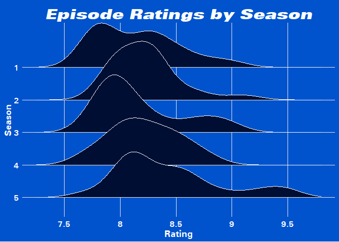
Well OK, we’re just looking at distributions… but I wanted to use this GIF in some capacity!
Cast Appearances
The main cast of Brooklyn Nine-Nine are pretty tightly knit and as members of the same precinct it makes sense that they’ll generally appear together. So instead, I wanted to look at which non-main cast members and guests made the most appearances on the show. Special note: Hitchcock and Scully weren’t officially “main cast” until Season 2 but I left them out of the non-main cast list.
After scraping the main cast list, I anti_join() them
so I am left with the non-main cast and the number of episodes that they
appeared in.
# Entire cast:
cast_info_clean <- readr::read_csv("https://raw.githubusercontent.com/Ryo-N7/brooklyn_NINE_NINE_viz/master/data/data2/cast_info_clean.csv")

# Main cast:
cast_main_url <- bow("https://en.wikipedia.org/wiki/List_of_Brooklyn_Nine-Nine_characters")

cast_main_raw <- scrape(cast_main_url) %>%
  html_nodes(".wikitable") %>%
  html_table(fill = TRUE) %>%
  flatten_df() %>%
  as_tibble()

cast_main_clean <- cast_main_raw %>%
  slice(-1) %>%
  select(Character)

# anti-join
non_main_cast <- anti_join(cast_info_clean, cast_main_clean,
                           by = c("name" = "Character"))
Non-Main Cast Appearances Plot
To shorten the list I’ll just look at the top five cast members. I
created a halfway variable so that the number labels will appear right
in the middle of each bar. Using the axis_canvas(), draw_image(),
and insert_axis_grob() from the cowplot package I can insert images
of the characters along the bottom of the plot.
non_main_plot <- non_main_cast %>%
  arrange(desc(episode_num)) %>%
  head(5) %>%
  mutate(halfway = episode_num / 2) %>%
  ggplot(aes(x = reorder(name, desc(episode_num)), y = episode_num)) +
  geom_col(fill = "#000E33") +
  geom_text(aes(y = halfway, label = episode_num,
                family = "Univers"),
            color = "#F9FEFF",
            size = 8) +
  scale_y_continuous(expand = c(0, 0), limits = c(0, 12.5),
                     breaks = c(2, 4, 6, 8, 10, 12),
                     labels = c(2, 4, 6, 8, 10, 12)) +
  labs(title = "Most Appearances by Non-Main Cast",
       x = NULL, y = "Number of Episodes") +
  theme_b99() +
  theme(panel.grid.major.x = element_blank())

# images
pimage <- axis_canvas(non_main_plot, axis = 'x') +
  draw_image(
    "https://vignette.wikia.nocookie.net/tvdatabase/images/d/d5/Adrian_Pimento.jpg",
    x = 0.5, scale = 1.3, clip = "on") +
  draw_image(
    "https://vignette.wikia.nocookie.net/brooklynnine-nine/images/a/ab/Kevin.jpg",
    x = 1.5, scale = 1.3, clip = "on") +
  draw_image(
    "https://vignette.wikia.nocookie.net/brooklynnine-nine/images/b/b3/Wuntch.png",
    x = 2.5, scale = 1.3, clip = "on") +
  draw_image(
    "https://vignette.wikia.nocookie.net/brooklynnine-nine/images/0/0a/Doug_Judy.png",
    x = 3.5, scale = 1.3, clip = "on") +
  draw_image(
    "https://vignette.wikia.nocookie.net/brooklynnine-nine/images/2/23/Vulture.jpg",
    x = 4.5, scale = 1.3, clip = "on")

# insert the image strip into the bar plot and draw
ncast_plot <- ggdraw(insert_xaxis_grob(non_main_plot, pimage, position = "bottom"))

ncast_plot
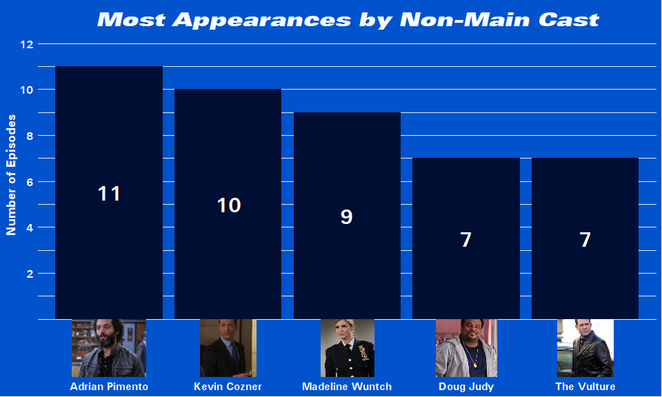
Adrian has appeared in the most episodes just beating out Kevin. This really shows how involved Adrian was in the story in Season 4 and 5 especially compared to Kevin who has been popping in and out since the first season. Everybody’s favorite DOUG JUDY rounds off this bar chart next to The Vulture.

Viewer Numbers
Pretty much the same M.O. as what I did to get the episode ratings here. One thing of note was using regex to get rid of the footnotes. I had to be careful to double escape the square brackets there.
url_wiki_df <- tibble(
  urls = c("https://en.wikipedia.org/wiki/Brooklyn_Nine-Nine_(season_1)",
           "https://en.wikipedia.org/wiki/Brooklyn_Nine-Nine_(season_2)",
           "https://en.wikipedia.org/wiki/Brooklyn_Nine-Nine_(season_3)",
           "https://en.wikipedia.org/wiki/Brooklyn_Nine-Nine_(season_4)",
           "https://en.wikipedia.org/wiki/Brooklyn_Nine-Nine_(season_5)"),
  season_num = c(1, 2, 3, 4, 5))

brooklyn99_ep_info <- function(url) {

  session <- bow(url)

  episode_raw <- scrape(session) %>%
    html_nodes(".wikiepisodetable") %>%
    html_table(fill = TRUE) %>%
    flatten_df() %>%
    as_tibble() %>%
    filter(row_number() %% 2 != 0)

  episode_table <- episode_raw %>%
  set_names(c("num_overall", "num_season", "title", "director", "writer",
              "air_date", "prod_code", "viewers")) %>%
  mutate(viewers = str_remove_all(viewers, "\\[[0-9]+\\]") %>% as.numeric)

}

ep_info_df <- map2(.x = url_wiki_df$urls, .y = url_wiki_df$season_num,
                          ~ brooklyn99_ep_info(url = .x) %>%
         mutate(season = .y)) %>%
  reduce(rbind)

ep_info_df %>%
  slice(77:83)
## # A tibble: 7 x 9
##   num_overall num_season title director writer air_date prod_code viewers
##   <chr>       <chr>      <chr> <chr>    <chr>  <chr>    <chr>       <dbl>
## 1 77          9          "\"T~ Dean Ho~ Luke ~ Decembe~ 409          2.31
## 2 78          10         "\"C~ Jaffar ~ Matt ~ Decembe~ 410          2.15
## 3 7980        1112       "\"T~ Rebecca~ Carol~ January~ 411412       3.49
## 4 81          13         "\"T~ Beth Mc~ Carly~ April 1~ 413          1.91
## 5 82          14         "\"S~ Michael~ Andre~ April 1~ 414          1.91
## 6 83          15         "\"T~ Linda M~ David~ April 2~ 415          1.88
## 7 84          16         "\"M~ Maggie ~ Phil ~ May 2, ~ 418          1.72
## # ... with 1 more variable: season <dbl>
tidylog Demonstration
A little intermission here as I wanted to talk about this cool package I recently found on Twitter called tidylog. To show you an example, I will take a look at which writers wrote the most episodes in Season 5:
library(tidylog)
##
## Attaching package: 'tidylog'

## The following objects are masked from 'package:dplyr':
##
##     anti_join, distinct, filter, filter_all, filter_at, filter_if,
##     full_join, group_by, group_by_all, group_by_at, group_by_if,
##     inner_join, left_join, mutate, mutate_all, mutate_at,
##     mutate_if, right_join, select, select_all, select_at,
##     select_if, semi_join, transmute, transmute_all, transmute_at,
##     transmute_if

## The following object is masked from 'package:stats':
##
##     filter
ep_info_df %>%
  select(season, num_season, title, num_overall, writer, viewers) %>%
  filter(season == 5) %>%
  separate_rows(writer, sep = "&") %>%
  mutate(writer = writer %>% trimws) %>%
  group_by(writer) %>%
  summarize(n = n()) %>%
  arrange(desc(n)) %>%
  head(5)
## select: dropped 3 variables (director, air_date, prod_code)

## filter: removed 89 out of 111 rows (80%)

## mutate: changed 6 values (24%) of 'writer' (0 new NA)

## group_by: 16 groups (writer)

## # A tibble: 5 x 2
##   writer                n
##   <chr>             <int>
## 1 Luke Del Tredici      3
## 2 Carly Hallam Tosh     2
## 3 Carol Kolb            2
## 4 Dan Goor              2
## 5 David Phillips        2
You can see that it gives you details on what each dplyr function
changed in your data frame in the order that the operations were
performed. It’s pretty cool and it gets more useful as your dplyr
pipeline grows longer! However, let’s turn tidylog off for now:
options("tidylog.display" = list())
The episode info data frame we got from Wikipedia had a lot of information so let’s chop it down a bit to get data on the number of viewers per episode.
From what we saw of ep_info_df earlier, the data looked pretty clean
already except for Episode 79 and 80 (“The Fugitive” episodes)…
There are other multi-part episodes throughout the show but this pair is
the only one that aired on the same day, on New Years Day 2017, so they
got smushed together in the Wikipedia table when we scraped it. There
wasn’t a quick and easy way to regex them into separate rows so I just
filtered them out and added them back in. Then at the end of the pipe, I
created a first and last variable for each season taking note of what
overall episode number the first and last episodes of each season were.
You’ll see why I did this soon.
viewers_df <- ep_info_df %>%
  select(season, num_season, title, num_overall, viewers) %>%
  # manually fix "The Fugitive" episodes
  filter(num_overall != 7980) %>%
  add_row(season = 4, num_season = 11, title = "The Fugitive: Part 1",
          num_overall = 79, viewers = 3.49) %>%
  add_row(season = 4, num_season = 12, title = "The Fugitive: Part 2",
          num_overall = 80, viewers = 3.49) %>%
  mutate(num_overall = as.numeric(num_overall),
         num_season = as.numeric(num_season),
         season = as_factor(as.character(season))) %>%
  arrange(num_overall) %>%
  group_by(season) %>%
  mutate(first = first(num_overall),
         last = last(num_overall)) %>%
  ungroup()
Viewers Plot
For this plot I used geom_rect() to give a colored background for each
season. I set the span of the Xs as the first and last episode
number of each season for the width and using Inf and -Inf for the
Ys to cover the entire height of the plot. For the season labels I
calculated the midpoint along the x-axis for each season and used that
as the x values (not shown in the code). I could have used facets but to
the best of my knowledge I wouldn’t have been able to place the labels
on top across multiple facets anyways. It may be possible by placing
text grobs on top of the facetted plot but I thought that would take
more time compared to what I did with geom_rect(). Otherwise I used a
lot of annotate() code to add in the episode details and season
titles.
# Color hex codes for season blocks:
cols <- c("1" = "#6CA9C3", "2" = "#3A3533",
          "3" = "#000E33", "4" = "#CBCFD2", "5" = "#175E78")

viewer_plot <- viewers_df %>%
  ggplot(aes(x = num_overall, y = viewers, group = season)) +
  geom_rect(aes(xmin = first, xmax = last,
                fill = season), alpha = 0.2,
            ymin = -Inf, ymax = Inf) +
  geom_line(color = "white", size = 1.1) +
  scale_fill_manual("Season", values = cols, guide = FALSE) +
  scale_y_continuous(limits = c(0, 20),
                     breaks = c(seq(0, 15, by = 2.5)),
                     expand = c(0, 0)) +
  scale_x_continuous(breaks = c(seq(0, 112, by = 5)),
                     labels = c(seq(0, 112, by = 5)),
                     expand = c(0, 0)) +
  labs(x = "Episode Number (Overall)", y = "Viewers (Millions)",
       title = "Viewers by Episode") +
  theme_b99() +
  theme(panel.grid = element_blank()) +
  # Line segments
  annotate(geom = "segment", x = 15, xend = 15, y = 15, yend = 16.,
           color = "black", size = 1.2) +
  annotate(geom = "segment", x = 34, xend = 34, y = 6, yend = 7,
           color = "black", size = 1.2) +
  annotate(geom = "segment", x = 79.5, xend = 79.5, y = 3.5, yend = 5,
           color = "black", size = 1.2) +
  # Episode details
  annotate(geom = "label", x = 7, y = 16.5, hjust = 0, size = 4.5,
           family = "Univers",
           label = "Operation: Broken Feather (Aired after Super Bowl XLVIII)") +
  annotate(geom = "label", x = 25, y = 7.5, hjust = 0, size = 4.5,
           family = "Univers",
           label = "Beach House (Sunday before First Workday of 2015)") +
  annotate(geom = "label", x = 67, y = 5, hjust = 0, size = 4.5,
           family = "Univers",
           label = "The Fugitive: Part 1 & 2 (New Years Day 2017)") +
  # Season titles
  annotate(geom = "label", x = 11.5, y = 19, size = 7,
           family = "Univers",
           label = "Season One") +
  annotate(geom = "label", x = 34, y = 19, size = 7,
           family = "Univers",
           label = "Season Two") +
  annotate(geom = "label", x = 57, y = 19, size = 7,
           family = "Univers",
           label = "Season Three") +
  annotate(geom = "label", x = 79.5, y = 19, size = 7,
           family = "Univers",
           label = "Season Four") +
  annotate(geom = "label", x = 102, y = 19, size = 7,
           family = "Univers",
           label = "Season Five")

viewer_plot
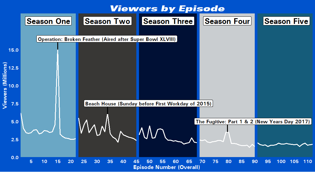
I added in details on why certain episodes had such high viewership compared to others from both my memory and a little digging but I wasn’t really sure about those three peaks in Season 3. One of them was a Halloween episode (which is up there with the Pontiac Bandit episodes for the best recurring episodes), but in terms of the actual airing dates I can’t quite remember anything significant happening on those days that would explain the high viewer numbers (relative to the other episodes in the season).
Throughout it’s run on FOX, the show averaged around 2~3.5 million viewers with numerous peaks and troughs until Season 5 where it only averaged around 1.8 million viewers but kept those numbers very consistently across the entire season.
Creating the Title Card
The last thing I want to do to wrap up this blog post is to create an infographic containing the plots I made above. Before I combine them all I want to make a title card that looks similar to the official Brooklyn Nine-Nine title card you see at the beginning of the episode. Here’s what it looks like:
Now I could’ve just added the picture into my graph but I
thought why not try making it myself? So, I used geom_polygon() to
construct the two diagonal colored bars and then placed the text on top
of them with annotate().
rect <- data.frame(id = as.factor(c(1, 1, 1, 1,
                          2, 2, 2, 2)),
                   x = c(16, 16, 0,    0,
                         16, 16, 6.6,  6.5),
                   y = c(5.1, 2, 0.4,  3.5,
                         2.5, 0.8, 0,  1.6))

header <- ggplot(data = rect, aes(x, y, group = id, fill = id)) +
  geom_polygon() +
  scale_fill_manual(values = c("#0053CD", "#000E33"), guide = FALSE) +
  annotate(geom = "text", y = 2, x = 1.8, hjust = 0,
           family = "Univers LT 93 ExtraBlackEx",
           color = "#fcf7e8", size = 40, angle = 5,
           label = glue("
                        BROOKLYN")) +
  annotate(geom = "text", y = 0.9, x = 7.2, hjust = 0,
           family = "Univers",
           color = "#fcf7e8", size = 28, angle = 3.5,
           label = glue("
                        NINE-NINE")) +
  scale_x_continuous(expand = c(0, 0), limits = c(0, 16)) +
  scale_y_continuous(expand = c(0, 0), limits = c(0, 5.5)) +
  theme_void() +
  theme(plot.background = element_rect(color = "#F9FEFF",
                                       fill = "#F9FEFF",
                                       size = 8))

header


After going through this process (read: very time-consuming ordeal) I don’t recommend making stuff like this manually as it can be quite frustrating, especially if you have to get it to fit alongside other plots and grobs!
Finally, let me just add a footer:
foot <- ggplot() +
 annotate(geom = "text", x = 12.5, y = 0.5,
          size = 4, family = "Univers", color = 'white', hjust = 0,
          label= glue("
                      Source: Wikipedia, Nielsen Ratings, IMDB
                      By @R_by_Ryo")) +
  lims(x = c(0, 16), y = c(0, 1)) +
  theme_b99() +
  theme(panel.grid = element_blank(),
        text = element_blank())

foot

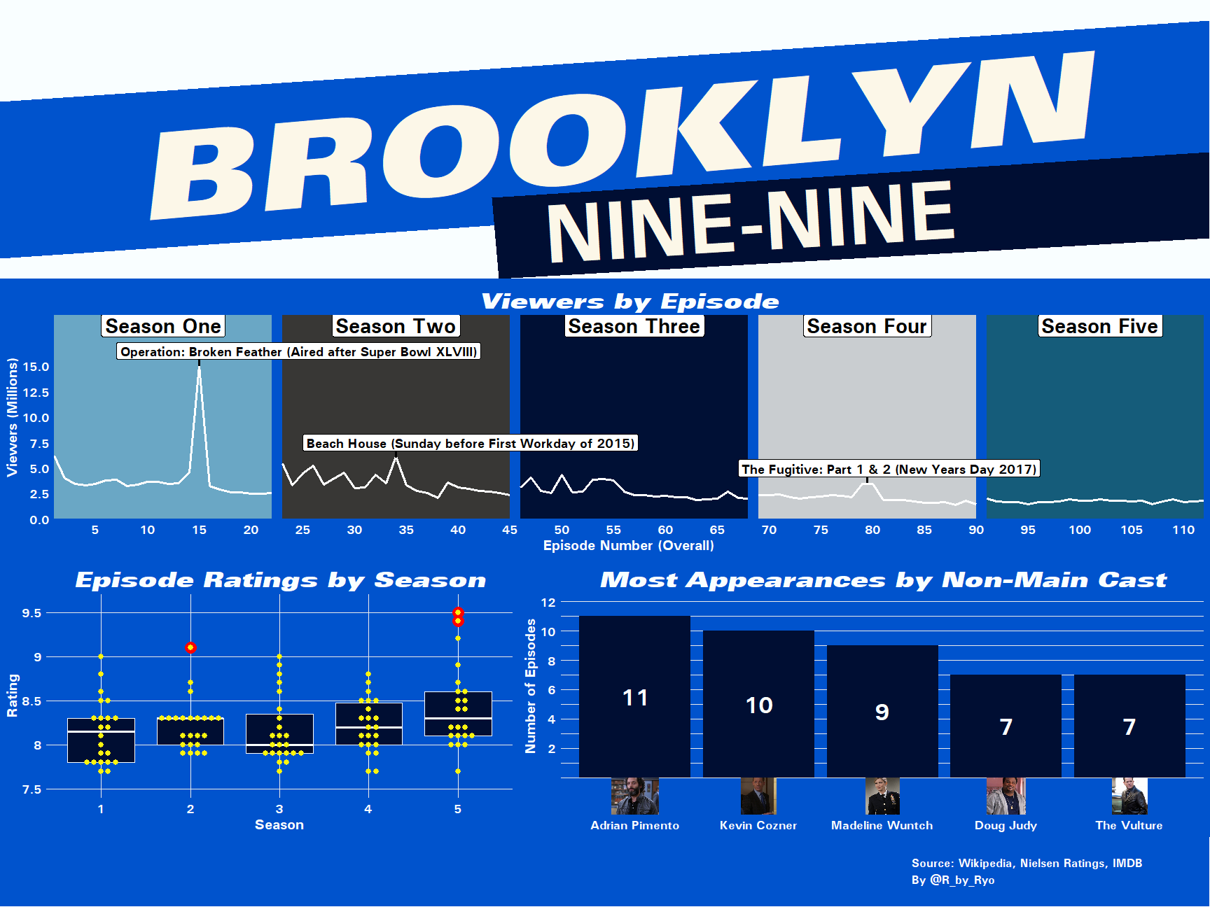
Arrange Plots with cowplot
With all the components done, now I just need to arrange all of the plots, the title card, and the footer together to create the Brooklyn Nine-Nine infographic!
There are several ways to do this like using grid.arrange() from the
grid package or the newer patchwork package but I went for
cowplot::plot_grid() this time.
the_nine_nine_plot <- plot_grid(
  plot_grid(header),
  plot_grid(viewer_plot),
  plot_grid(box_plot, ncast_plot,
            rel_widths = c(3, 4)),
  plot_grid(foot),
  ncol = 1, rel_heights = c(1, 1, 1, 0.25))

the_nine_nine_plot

Conclusion
In this blog post I went over creating your own custom ggplot2 theme,
web scraping, cleaning and tidying data frames with the tidyverse, and
creating a variety of plots to show simple statistics on Brooklyn
Nine-Nine. You can check out all the code in this GitHub
Repo.
The plots were pretty simple so the main problems I had were in sizing
and scaling stuff properly. I feel like some of it is still not perfect
but it’s good enough for now. This is an area I feel like I need to
improve on and find ways to automatically scale things using magick or
custom functions. This was also my first time using a different color
scheme for my plots, usually I just slap theme_minimal() to most
things and call it a day. It took me a while to get the color
coordination right and I think I got it to a level where it isn’t
nauseating to look at!
To conclude I just wanted to list out my top five “Cold Opens” (in no particular order):
Agree? Disagree? Let me know in the comments below!
I hope you had as much fun reading this as I did making it. If you didn’t, then well…