Midst a monsoon, another TokyoR meetup! Since the pandemic started all
of TokyoR’s meetups have turned into online sessions and the transition
has been seamless thanks to the efforts of the TokyoR organizing team.
This was the 101st TokyoR
Meetup!
My previous TokyoR roundups:
- Japan.R 2018 (12/1/2018)
- Tokyo.R #76 (3/2/2019)
- Tokyo.R #77 (4/13/2019)
- Tokyo.R #78 (5/25/2019)
- Tokyo.R #79 (6/29/2019)
- Tokyo.R #80 (7/27/2019)
- Tokyo.R #81 (9/28/2019)
- Tokyo.R #87 (8/1 /2020)
As you can see it was my first TokyoR in quite a long time, so it was nice to be back! On top of short summaries of all the talks I will also provide some helpful links and resources of my own to supplement the content of the talks.
Let’s get started!
BeginneR Session
As with every TokyoR meetup, we began with a set of beginner user focused talks:
Main Session
Data cleaning with Palmer penguins - @bob3bob3
@bob3bob3 presented on data cleaning techniques using the Palmer
penguins data set.
install.packages("palmerpenguins")
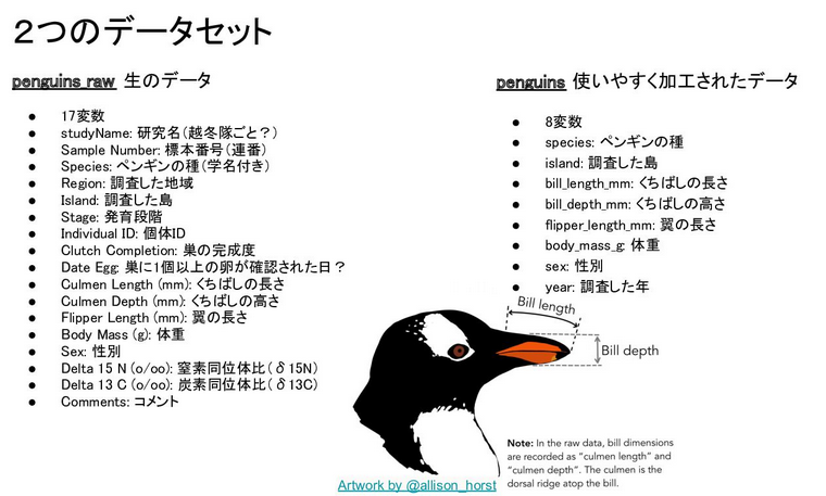
This data set consists of data on 3 species of penguin with details about their weight, wingspan, beak length, etc. There are two data sets included within the package:
penguins_raw: the raw data set gathered from studypenguins: the cleaned version
The goal of this talk was to start from penguins_raw and get close to
the cleaned penguins data set.
As a first step, we explored the data set from the lens of the
summarytools::dfSummary() function which provides us with a summary
view of the data.frame.
library(palmerpenguins)
library(summarytools)

penguins_raw |>
  dfSummary() |>
  View()
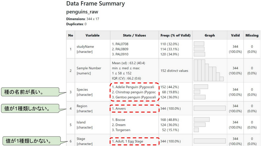
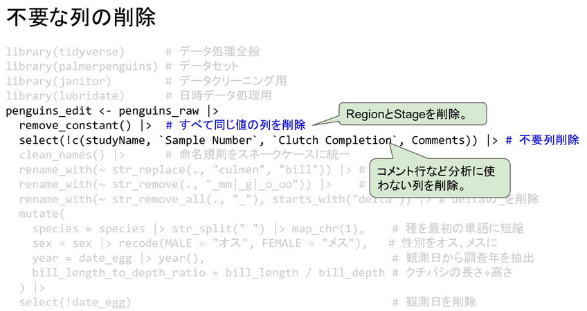
From here we were able to identify various problems with the data set
and come up with a plan to clean it. Using packages such as the
{tidyverse} group, {janitor} and {lubridate}, @bob3bob3 explained each
step of the long piped chain of cleaning operations.
@bob3bob3 said he’ll continue this series as he plans on doing another
talk on EDA and visualization, and then more planned talks on doing
various statistical analysis on this data set.
Resources
Regression Analysis with R - @kilometer00
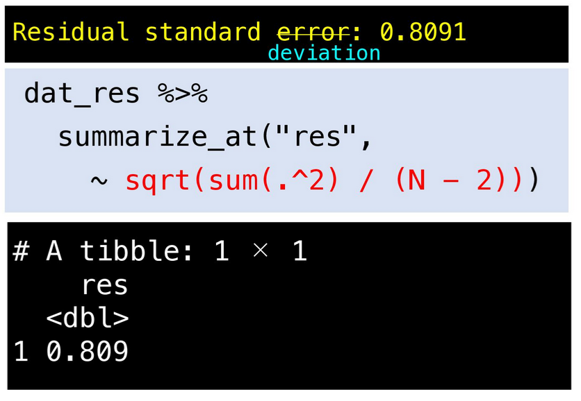
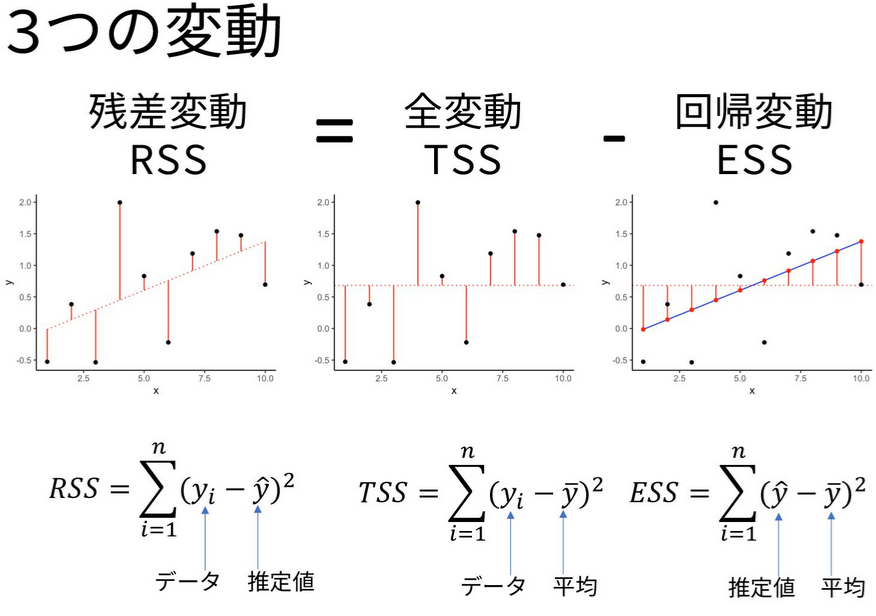
TokyoR organizer, @kilometer00 gave a very thorough overview of
regression analysis using R. From using the base lm() function, to
going step-by-step to calculating the various statistical outputs
(residuals, standard errors, F-statistic, etc.) manually, and concise
explanations of all of the formulas behind them, this was a helpful
intro for anybody trying to understand linear regression using R.
Resources
- Linear Models with R - Julian J. Faraway
- Extending the Linear Model with R - Julian J. Faraway
- Statistical Inference via Data Science: A ModernDive into R and the Tidyverse - Chester Ismay & Albert Y. Kim
Lightning Talks
R and Snowflake - @y__mattu
One of the organizers of TokyoR, @y__mattu, gave a short intro to
using snowflake with R. Snowflake is a cloud database platform, one of
many that have grown out of the emergence of cloud data warehouses
following a long period of time where database software was basically
dominated by the likes of Oracle and MySQL.
However, there is no R package (…yet?) that directly connects with Snowflake so one needs to setup an ODBC driver and use the {DBI} package.
library(DBI)
library(odbc)

myconn <- DBI::dbConnect(odbc::odbc(), "SNOWFLAKE_DSN_NAME", uid="USERNAME", pwd='Snowflak123')
mydata <- DBI::dbGetQuery(myconn,"SELECT * FROM EMP")
Resources
- Snowflake R/RStudio Integration: How to Connect & Analyze Data? - Hevo Data
- How To Connect Snowflake with R/RStudio using ODBC driver on Windows/MacOS/Linux. - snowflake community article
- Accessing Snowflake with R - Martin Stingl
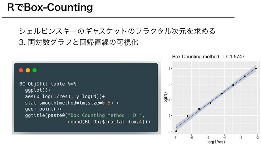
Buying art with R - @saltcooky
@saltcooky likes Jackson Pollock’s artwork and in this LT he talked
about using R to do fractal analysis of Pollock’s world famous drip
paintings.
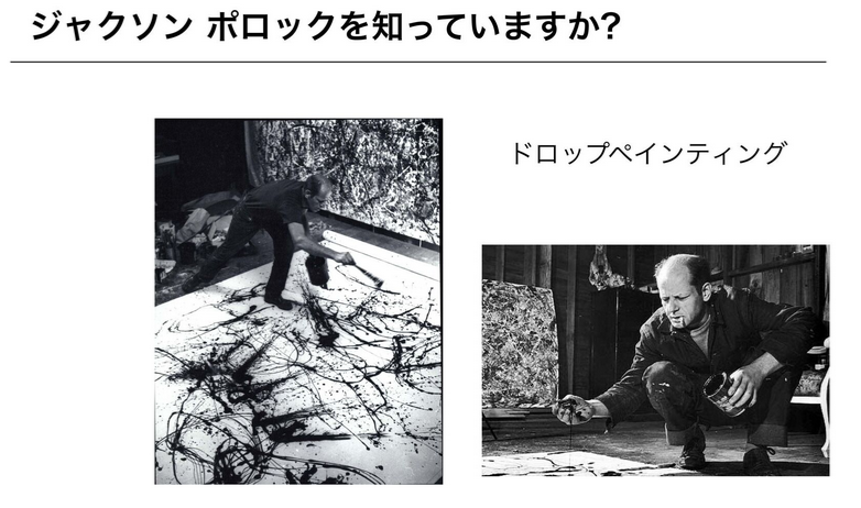
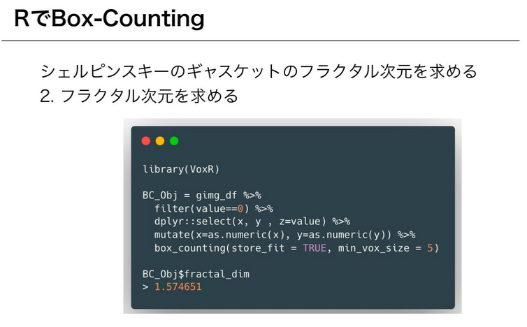
@saltcooky gave us an intro to fractal analysis, talking about the
fractal dimension and the mathematical theories behind in. One of the
ways to calculate the fractal dimensions of an object is to use the
box-counting algorithm. In R, we can use the {VoxR} package,
specifically the box_counting() function.
Resources
- {VoxR}: Trees Geometry and Morphology from Unstructured TLS Data - Bastien Lecigne
- Fractal analysis of Pollock’s drip paintings. - R.P. Taylor, et al. 1999.
- On multi-fractal structure in non-representational art. - J.R. Nureika, et al. 2005.
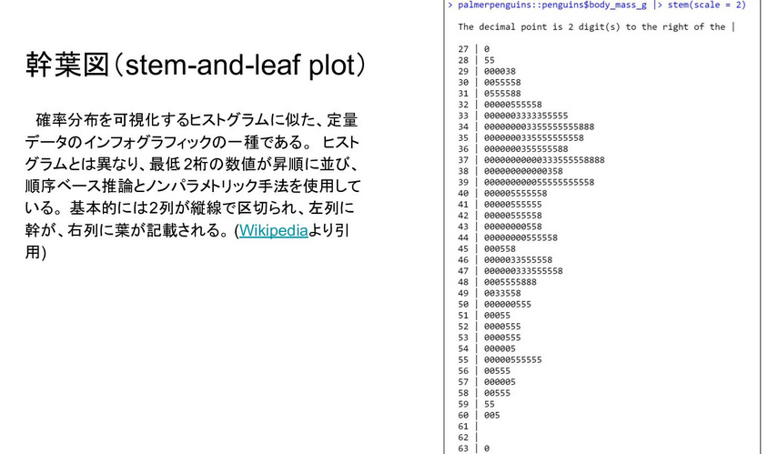
Graphs - @bob3bob3
In his 2nd presentation of the day, @bob3bob3 talked about graphs,
specifically some visualization functions that are included in base R.
Why does R have these functions? … For compatibility with S.
For those that might not get the joke/adage/whatever, these visualizations continued to exist in R, in part, due to its origins in its predecessor language, S.
First is the stem-and-leaf plot, which is similar to the histogram that
most people should be familiar with. Unlike the histogram, however, the
stem-and-leaf plot tries to retain as much of the original data as
possible and orders them from least to greatest in both the “stem” and
“leaf” part of the plots. R users can create this plot via the stem()
function which is available from base R graphics functionality.
Next are the Chernoff face graphs. This is a type of visualization invited by Herman Chernoff to display multivariate data in the shape of a human face. The ways to see how each individual data point is differentiated is by how the Chernoff graph displays the individual parts of the face differently by the shape, size, placement, and orientation.
R users can create this type of visualization via the {aplpack} package,
specifically the faces() function. @bob3bob3 provided an example using the Palmer penguins data set that he used
in his previous presentation.
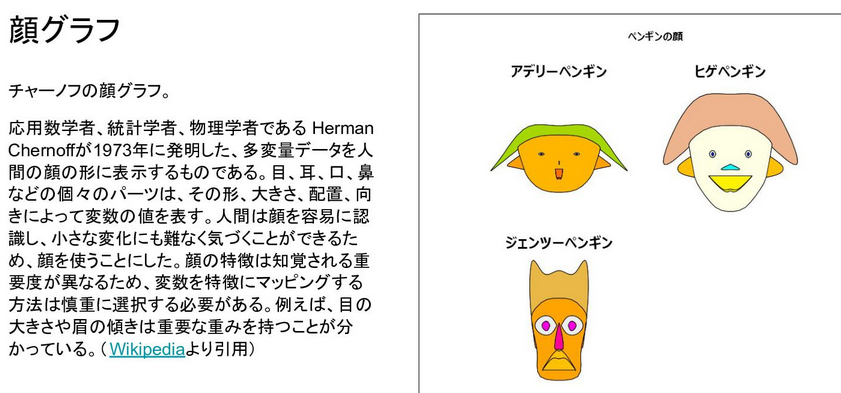
Nowadays to achieve a similar goal to view differences in multivariate data, people can make radar plots or parallel coordinate plots.
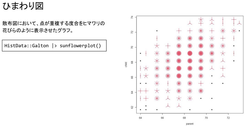
Finally, @bob3bob3 talked about sun flower plots. Sunflower plots are
a variant of the traditional scatter plot that tries to reduce over
plotting by adding petals for areas on a plot where multiple data points
have similar values. Base R has the sunflowerplot() function available
for easy access to this type of visualization.
Resources
-
Hermann Chernoff (1973). The use of faces to represent points in k-dimensional space graphically. Journal of the American Statistical Association, 68(342), 361–368.
-
{aplpack}: ‘Bagplots’, ‘Iconplots’, ‘Summaryplots’, Slider Functions and Others - Hans Peter Wolf
-
{ggChernoff}: Chernoff face geom for {ggplot2} - David Selby
-
Schilling, M. F. and Watkins, A. E. (1994). A suggestion for sunflower plots. The American Statistician, 48, 303–305. doi: 10.2307/2684839.
Conclusion
The next TokyoR meetup is scheduled for sometime near the end of October. Please follow the official TokyoR Twitter account to keep tabs on any new updates or you can visit the TokyoR website for details on past and future meetups. For the time being meetups will continue to be conducted online. Talks in English are also welcome so come join us!